We worked on the chat contrast ratio. How will it improve your UX?

Hey there! I’m Eugene, a designer in Dashly product team. Today, I’m going to tell you how we approached the contrast of our live chat elements.
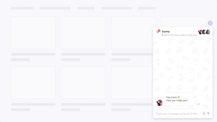
Our live chat is the first thing our customers see after they implement Dashly’s scripts. Customers favor our chat’s design, so we need to maintain a high level of our product. With our live chat and some built-in tools like chatbot, customer support and consult their users daily, collect leads, and sell.
Live chat helps bring companies and their customers together, so its design should be thought out well. Elements should be clearly visible and look well together. Over time, it dawned on us that we didn’t consider all use cases in our live chat design, so in some cases, it was too complex to be perceived properly. This is mostly a detective story of how crucial it is for our users to customize a live chat without usability issues.
Read also: 17 Zendesk alternative services and 13 live chat alternatives to try this year
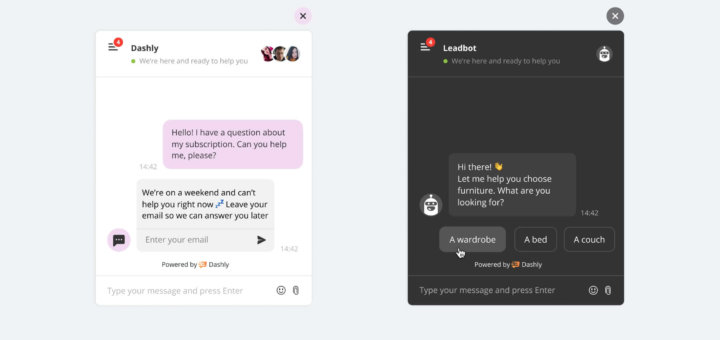
How it used to be
Apparently, when implementing a live chat, you want to adjust it to your website’s design. Luckily, Dashly’s live chat provides a dozen opportunities:
- the color of widgets and chat elements;
- a light or dark chat theme is our feature that no competitors can provide;
- a background;
- the widget’s icon and animations for a standard icon;
- the text in the chat header;
- a welcome message or no welcome message;
- an auto-reply to a user’s message if all agents are busy;
- etc.
In a nutshell, customizing a live chat to your website is as fun as creating a Sims or a Cyberpunk 2077 character.
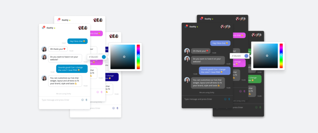
However, the more diversity, the higher the risk to select incompatible elements by mistake, like illegible colors or blending contrastless elements.
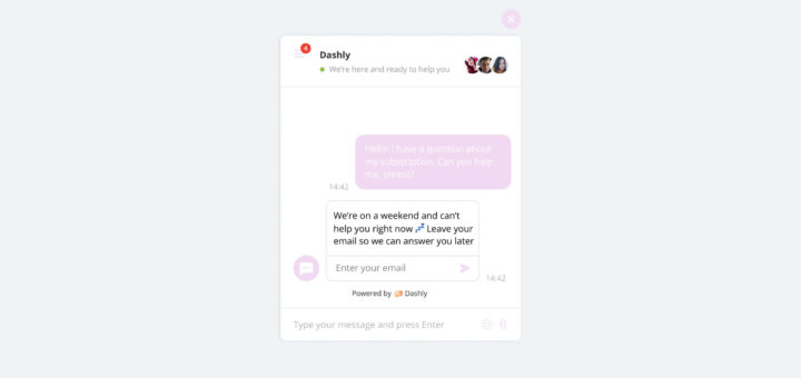
That’s what we encountered when our customer started to configure chatbot. If you choose a dark chat theme and dark text color, you can’t read the chat buttons. The chat looked as if something crashed.

After we explored this issue, we found a couple more related issues:
- We had two different approaches to painting elements in dark or light themes. In the light theme, we painted elements like menu icons, files, and emojis in the color that the user selected. In the dark theme, all these elements remained white.
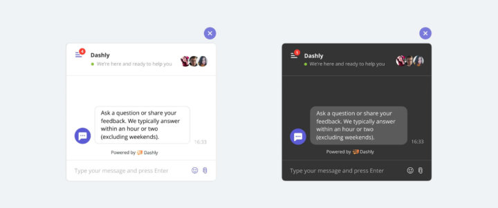
- The text in messages and some elements were always white, while the background color was set by users. Eventually, we could see some illegible combinations.
Read also:
15 best lead generation services to grow your base in 2023
The 36 statistics on how chatbot for businesses grow your revenue in 2023
The secret weapon of your competitors or Why you should focus on customer service first
The task: winning contrast
We explored how authors, designers, and developers of other live chats and messengers addressed this issue. Many of them can automatically pick dark or light colors of the text and other elements depending on the background color. We discussed this approach within our team and started to look for ways to implement it in Dashly.
We decided to calculate the сontrast ratio of the text color selected in a chat and categorize it as light (#fff) or dark (#333) depending on the chat color theme. We used the WCAG for that task.
First, we wanted to stick to the AA level which meant that the text contrast ratio was 4.5 or higher.
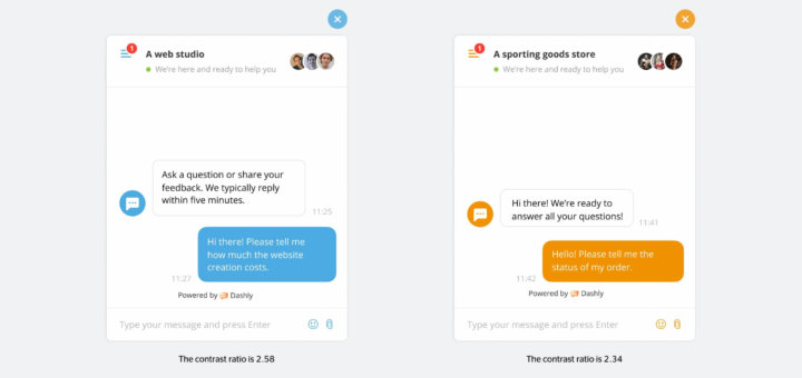
Then, we applied the algorithm to colors our customers used in their live chats. Turns out, in over 30% of all live chats, the contrast ratio was below 4.5. So, changing the algorithms could repaint live chats on too many websites, and many customers might find it disappointing.
We thoroughly examined these customers’ cases. This ratio is a global standard, yet it’s rather rigid and doesn’t accept slight alterations that look good and can be easily perceived by users.
At that time, we decided to explore other products to see which contrast ratios they used. We retrieved these data on a trial basis:
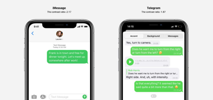
— Telegram depicts the text and the message element with a contrast ratio of ∼1.9-2.0.
— The background of SMS on iPhone has a contrast ratio of 2.17, though Apple emphasizes the importance of the AA standard in their guidelines (the ratio of 4.5).
— Some Facebook Messenger themes have a contrast ratio of below 1.85 of the message background and the message text.
— TIDIO’s ratio is ∼3.6 for an automatic color detection depending on the background color, however, you can manually select a dark or light text color.
Read also: 10 conversion rate optimization tools to enhance your funnel and boost revenue
— Jivo’s ratio is ∼4.35 in the automatic mode, but you can also switch between dark or light colors.
— Drift uses 2 separate colors, one for background and another for text. There are contrast guidelines in the platform based on the AA standard (the ratio is 4.5).
— Intercom uses a ratio of ~1.6 to detect the text color concerning its background.
We found that just a few products met contrast benchmarks. That’s why we adjusted our algorithm and changed the minimum contrast ratio to 2.0 in the light theme and 2.5 in the dark theme.
Thus, our updates will only impact a few of our current users. But we’re also going to address all possible issues and improve the chat’s usability dramatically.
Today, if we see the contrastless elements, we automatically adjust them to the color you select using the following algorithm:
- You select the chat color.
- You select the chat theme (dark or light).
- We calculate the contrast ratio.
- We select contrastive icons and message colors.
Read also: Customer engagement strategy template to create omnichannel campaigns
Read also:
The Sales Funnel Report Checklist Every Marketer Needs
Transform Your Marketing with an Automated Sales Funnel
Key takeaways
- We developed an algorithm that helps you avoid mistakes in setting chat colors. If you find your elements illegible, we’ll automatically replace them with contrastive ones, but the color you select will automatically appear in a widget as you hover on it.
- We aligned the overall algorithm of color adjustments in dark and light themes.
- We did our best to ensure the changes wouldn’t impact many customers. Only the ones with illegible chat messages will notice the change.
Most users didn’t even notice these adjustments. New customers can configure a live chat and chatbot easily because now the icon and text colors are selected automatically based on the chat color.
Attention to detail is important for the design to deliver the objectives and ensure a great user experience. I’m happy that we made our live chat easier to configure without color limitations for our users.
Read also:
👉 Live Chat Best Practices: 20 Hacks to Make Customer Service Better
👉7 Best Live Chat for eCommerce: Boost Conversion on your Website
👉 Top 5 live chat mobile app: find the best fit for your business
👉 Live Chat: How Online Chat Tool Can Help Your Business
👉 20 Best Live Chat Software for your website chat service