38 Best Website Popup Examples: Pop Up Design and Copy
The world of pop-ups is lovely, interesting, and is limited only by your fantasy. Pop-ups help you start a conversation with visitors, capture leads, activate, retain, and so much more.
Dashly clients make a professionally designed pop-up easy as 1-2-3 without designers’ and developers’ help.
Intrigued?
Further more, to inspire you, we took the best experience of pop-up implementation from our clients and combined it with excellent examples from eCommerce, EdTech, and SaaS companies.
Inspiring examples of how eCommerce websites use pop ups
We analysed how different industries use popups on their websites, so you can find here examples for every occasion.
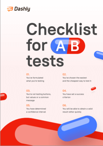
If you’re limited in time, just download the collection of 100 popup CTAs tested by Dashly clients.
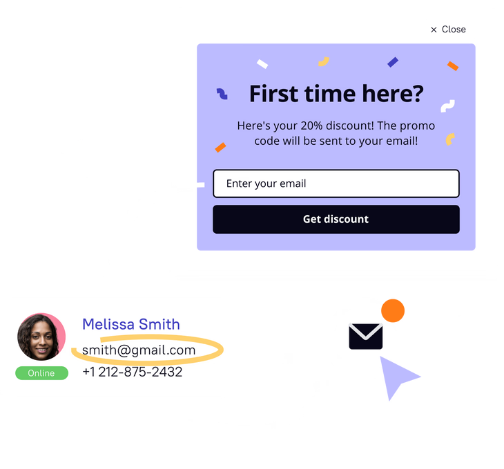
Highlight special offers for a first-time site visitor
Conversion is far from the end of what the offered time discount can do for you. This engagement tool can increase customers’ trust, loyalty, and customer satisfaction rate.
Get a free website audit and improve your conversions with Dashly experts
Let’s schedule a 30-minute call and find out how to:
- Improve your website conversion.
- Grow your ROI/ROMI with proven hypotheses that fit your audience.
- Optimize or launch ad channels without additional budget.
- Decrease SLA workload by saving their time on lead processing.
#1 Navigation popup window from a clothes store
But only if you would use it right. One of great examples is ASOS — a British online fashion and cosmetic retailer. It used pop-up to entice customers activity on sales landings. By routing them directly to a special offer for the women or men section, they eliminate the navigation clicks in the menu. That saves the customer time and improves the on-site customer experience.
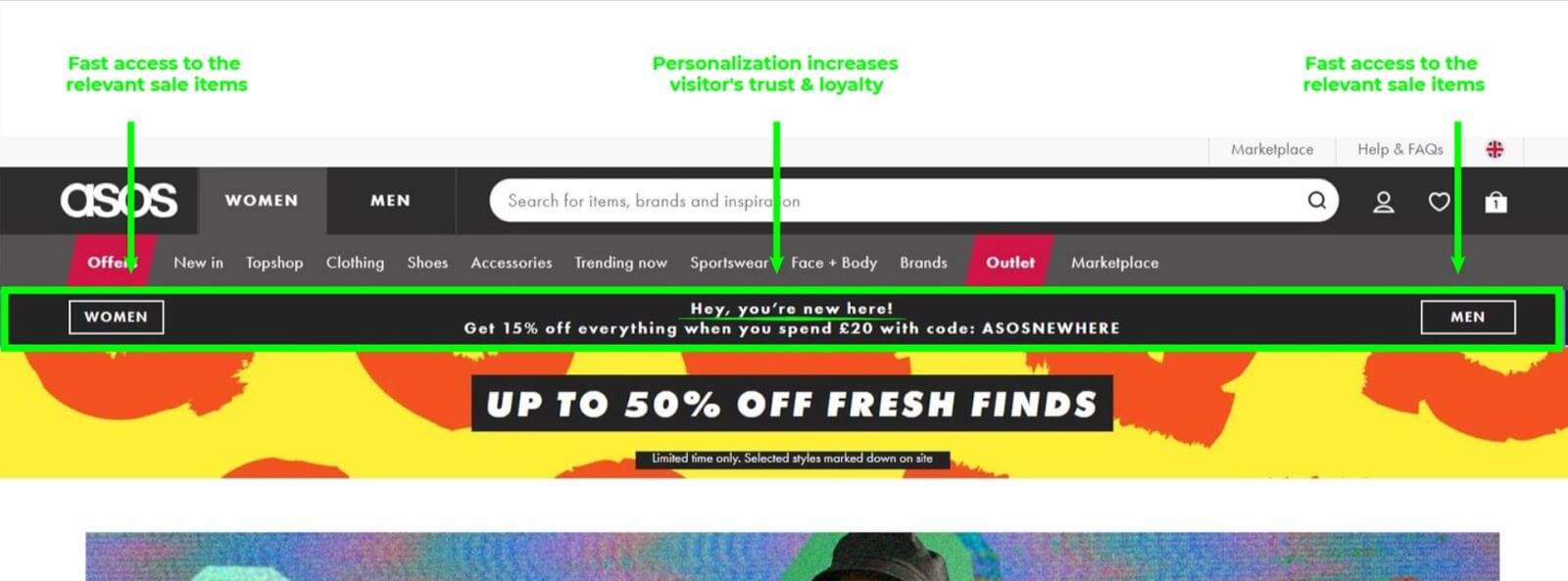
The banner’s non-intrusive style helps to stand out among other bright site elements and makes it safe from a well-known “banner blindness” effect.
#2 The short trail popup from a dog mats store
One of Dashly’s clients — “He&She” sex-shop, has a “Sexopedia” section on their website. It has a separate domain name, and it decreases the blog’s traffic significantly. To draw more attention to “Sexopedia” we set up a pop-up and launched A/B testing of the pop-up’s design and location. The offer in both tools was the same:
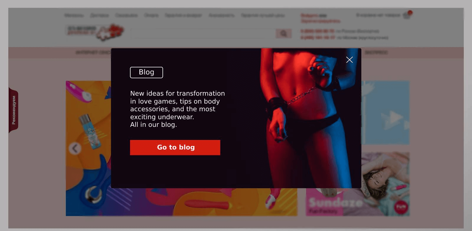
Visitors didn’t have to make an order to see the pop-up. We offered them to read articles relevant to the last item’s category they looked through. With the help of two accents: popup headline and CTA button, they engage people to a simple action ─ visit a blog page.
Read this store success story.
Pro Tip: Don’t use two pop-ups close options together with similar functional. One of examples to avoid is ⊗ element together with a “no, thanks” text alternative in a pop-up window.
#3 Navigation popup from LEGO
What if your site serves two or more equally essential goals, which one would you highlight? Try to follow LEGO, a toys’ manufacturer line. There are e-store and a play zone navigation message that pops up when you visit a website for the first time:
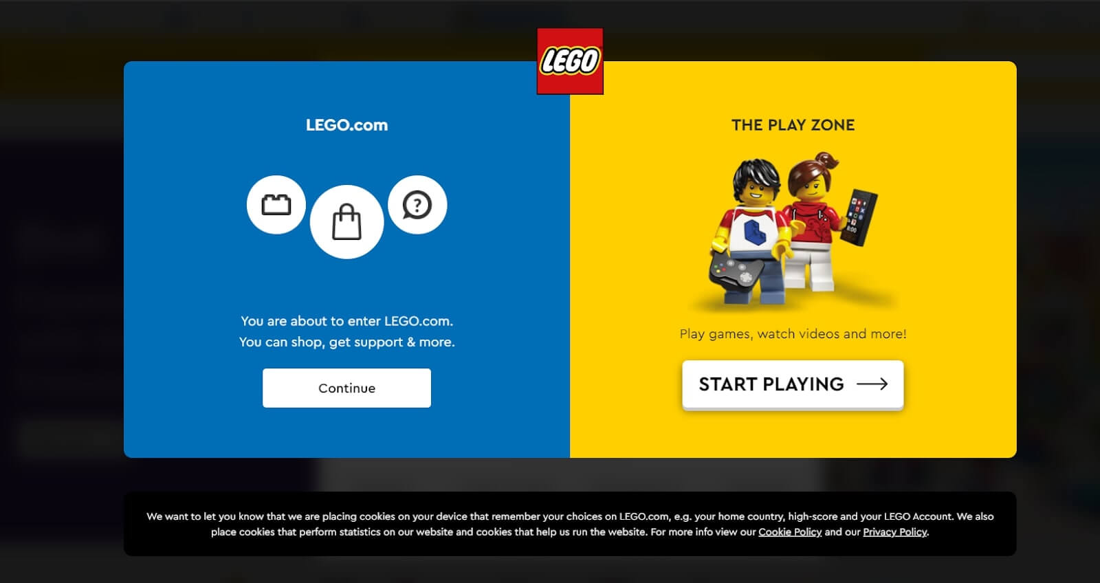
No sales, only useful info. Popup CTAs are different, but they serve the same goal ─ show the direction.
Pro Tip: If there are two parts in your pop-up window, sync their CTA goals ─ to navigate, sell, or inform. For instance, “to guide to the store and blog” popup example is a possible option because it is about navigation. But it can’t be “save 20% on jeans and visit our blog” because of different intents: sales and navigation.
Here you should prioritise and use classic pop-ups with one goal and relevant CTA: “save 20% on jeans” or “visit our blog”.
Another way how e-stores welcome visitors is a lead capturing pop-up windows. So, let’s go deeper into the best popup examples.
Highlight the value when collecting email addresses
This pop up applies at any stage of the customer journey (except for those already in your list). If the popup goal is clear, the content varies. Popular e-stores, what do they offer in exchange for a visitor’s email address?
That’s easy, a discount. But why does one pop-up work and others don’t? Let’s figure out!
How Dashly helped increase sales by 55%
in an online shop using pop-ups, emails and live chat >
Spoiler alert: It’s not only about a discount size.
Read also: 15 Best Free & Paid Sales Funnel Software for Every Need
#4 Discount popup from an online service for creating photo books
Mofy.life is an online service for creating photo books. As Dashly client they wanted to capture emails of visitors, who didn’t purchased from them. So, they launched a popup for visitors, whose emails they don’t know with a discount for the first photo book.
They used one of the Dashly pop-ups template for a quick start and launched the button color A/B test.
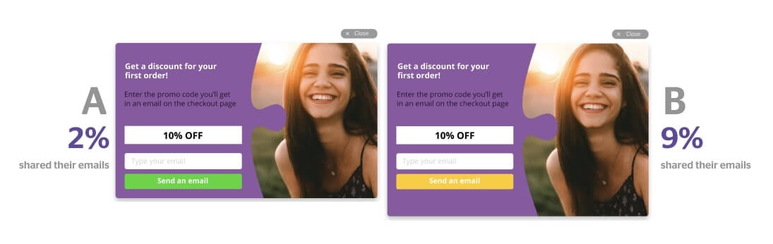
The results were quite intriguing. Only 2% of users who saw the option A shared their emails while 9% preferred the option B.
Pro Tip: ½ of a pop-up window takes a stylized photo of a product. That drives visitors’ attention to the result: here is what you came for ─ and you’ll have this beauty on your shelf even cheaper than you expect!
Want to get a free marketing audit?
Let’s schedule a 30-minute call and find out how to:
- Improve your website conversion.
- Grow your ROI/ROMI with proven hypotheses that fit your audience.
- Optimize or launch ad channels without additional budget.
- Decrease SLA workload by saving their time on lead processing.
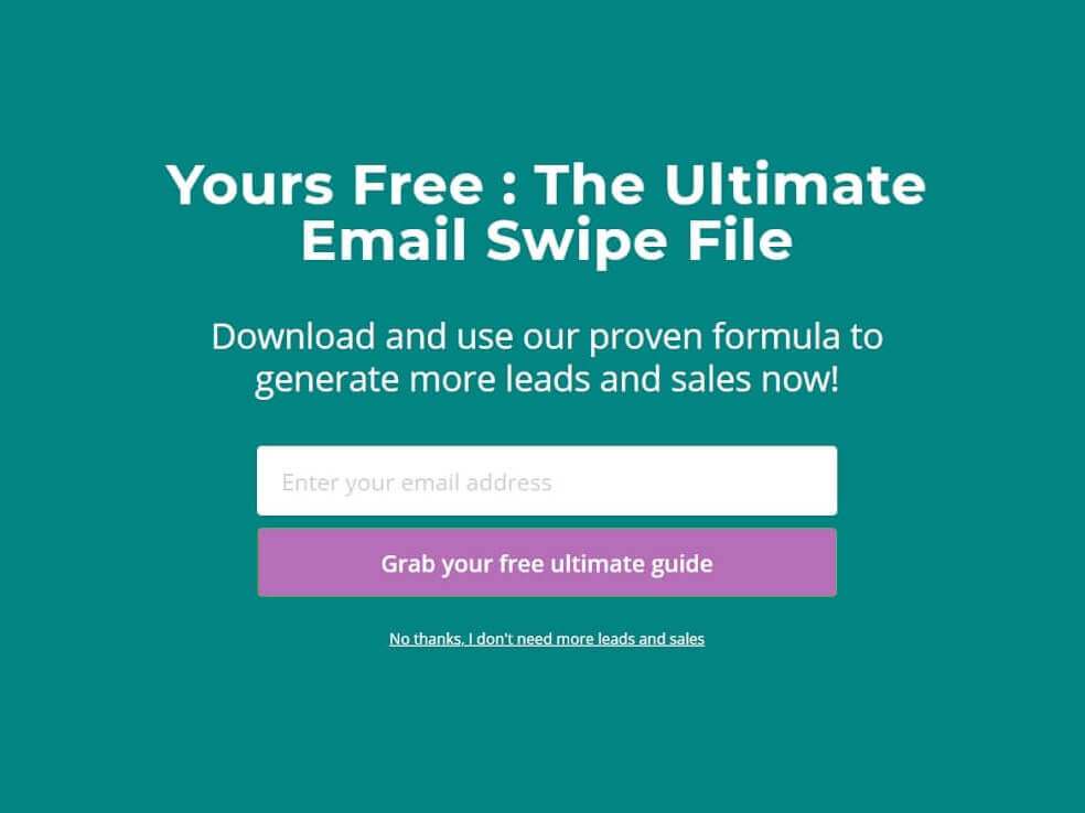
#5 Discount + FOMO tip from bags, jewellery and dresses store
If you don’t want to focus on a specific group of items, there are no-image subscription pop ups. Usually, they include a text and email capturing field with a contrast CTA button, using solid colors background. Just like on the Kate Spade’s ─ bags, jewelry, and dresses store website.
After a minute on the main page, visitors see this, free of bright colors or images, with a simple call to action:
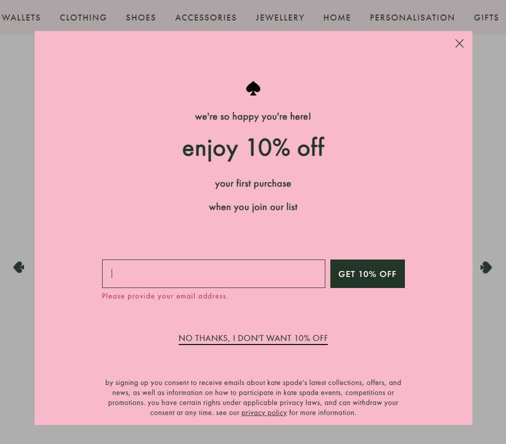
The first purchase discount is highlighted in the header and lead capture form — a basic tactic. The most exciting part is a bit lower. I mean, play on the FOMO effect in the anchor of the pop-up closing link.
Pro Tip: It is about “my perspective”. With no hesitation, we click “no thanks” to somebody’s offer. But it’s a whole different story when it is you who refuse a valuable opportunity. To avoid future regret, you’ll think twice even if you don’t need an item now. That is what a simple “I don’t want ____” or “I’d rather pay a full price” popup phrase does. Use it.
And last but not least in priory for popup copy is a detailed description of the newsletter content and privacy policy link (GDPR in action).
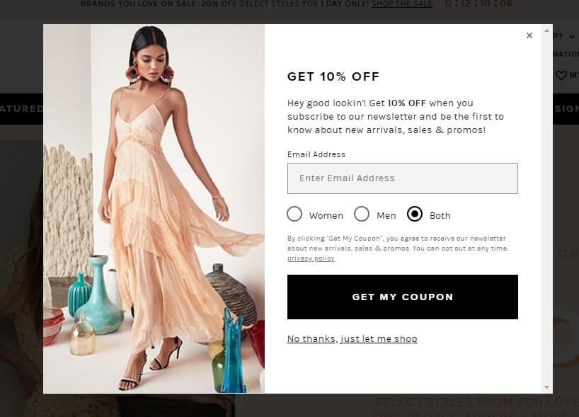
#6 Discount popup + segmentation from a clothes store
Revolve fashion retailer email pop-up message may seem to have the same discount header, CTA, the pop-up close link. We saw those three abstracts before. But look under the email field. A valuable detail when a user is free to choose what information to subscribe to:
Here is another design of email pop-up with a subscription segmentation by interests from a Frank And Oak clothes store:
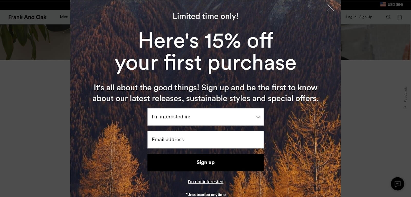
Just choose the one you like more. Email subscription segmentation is a good start for a two-way conversation with a potential customer. The more relevant your offer, the better customer experience you provide, the higher chances a subscriber will buy it and then others.
And speaking of chances. One more tool to capture your visitors emails. Try chatbot 👇
Thank you! Your playbook is already in your inbox
# 7 Giveaway from Ruroc, a sport helmets’ manufacturer
The opportunity to win a pricy piece is way more intriguing than a simple discount. Thus, everyone sees this email pop up:
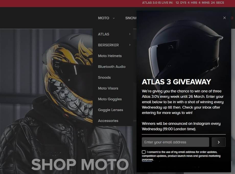
This is a justified use of detailed description in pop-up window. Look how gently they engage email subscribers to follow them on socials. Mind attribute to GDPR ー a checkbox for subscription agreement.
#8 Knowledge in exchange for an email
Information is the gold of the 21st century. Thus, Best Buy online store popup example offers users to be the first to know about deals and company news either by email or text message:
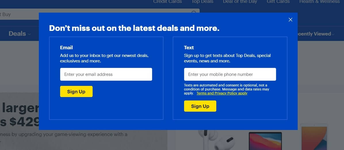
Pro Tip: When providing two subscription options, don’t duplicate the description. If you’ll send the same info by both channels, write about it in a pop-up window description part once. Use two descriptions if you plan to send different content.
#9 FOMO with timer from a sex-shop
For visitors who abandoned carts, “He&She” sex-shop launched a timer pop-up to encourage them to finish a purchase. When visitors come back to the website, the pop-up offers them to place an order in 30 minutes and get a discount. If a visitor agrees, the timer starts.
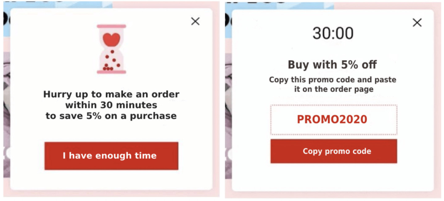
The result: 410 visitors reacted to the pop-up and activated the promo code in the cart. The timer pop-up brought +11% revenue in a month.
Read the “He&She” success story.
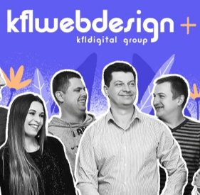
Another way to prevent visitors from leaving your website is to show the items added to the cart and a discount on these items. This is exactly strategy that Kflwebdesign flower shop team implemented with Dashly. Thus, everyone who had an items in their carts and tried to leave the store saw a following message:
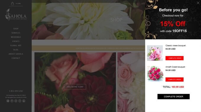
Results: 36% of unregistered visitors who have seen the pop-up made a purchase.
Want to get a free marketing audit?
Let’s schedule a 30-minute call and find out how to:
- Improve your website conversion.
- Grow your ROI/ROMI with proven hypotheses that fit your audience.
- Optimize or launch ad channels without additional budget.
- Decrease SLA workload by saving their time on lead processing.
Pop ups to expose the privileges of registered visitors
When visiting e-commerce sites, in the right upper corner, you may see a sign-up option. To provide the best customer experience, e-stores collect relevant data by offering to sign-up in a pop-up window.
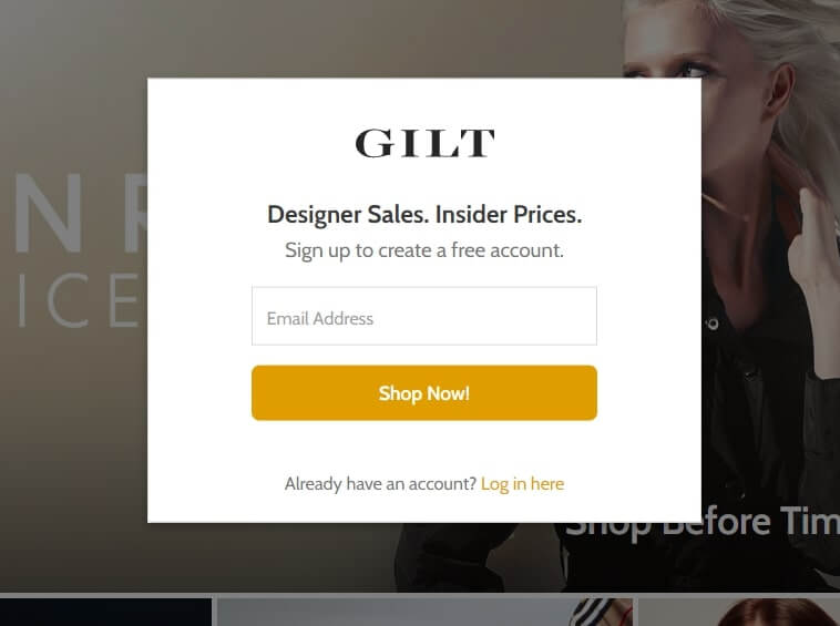
#10 Free account
You can’t access the GILT fashion store without leaving your email in this pop-up because there is no opportunity to close it:
Other brands aren’t so demanding. Thus, Zappos shoe store sign-up pop-up is more unobtrusive:
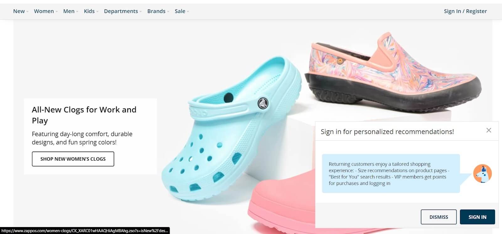
A small window in the right corner of the screen doesn’t overshadow the content.
Pro Tip: The main advantage of this pop-up idea is a list of VIP members’ benefits. It isn’t a claim like in the previous case, but an offer. Everyone understands what they’ll get by clicking “SIGN IN”.
And, of course, a classic move with a discount from Proviz ― Cycling, Running and Outdoor Sportswear e-store:
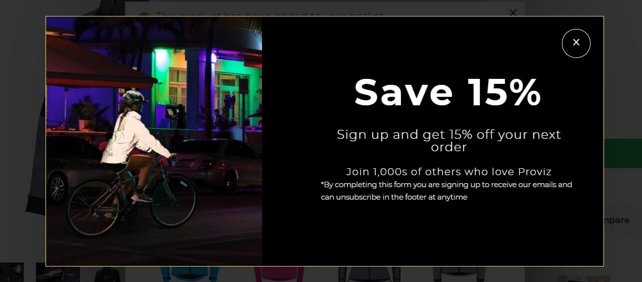
By clicking on this pop up and signing-up you automatically subscribe to the Proviz email newsletter also.
Get customers to add more to their carts
“You may also like”, “Customers who bought this also shopped”, “Frequently bought with ___” aka product recommendations.
Popup example #11
Dashly team set up complimentary products pop-up to increase the average check in the “He&She” sex-shop. When customers add something to a cart, we offer them some other products that might come in handy:
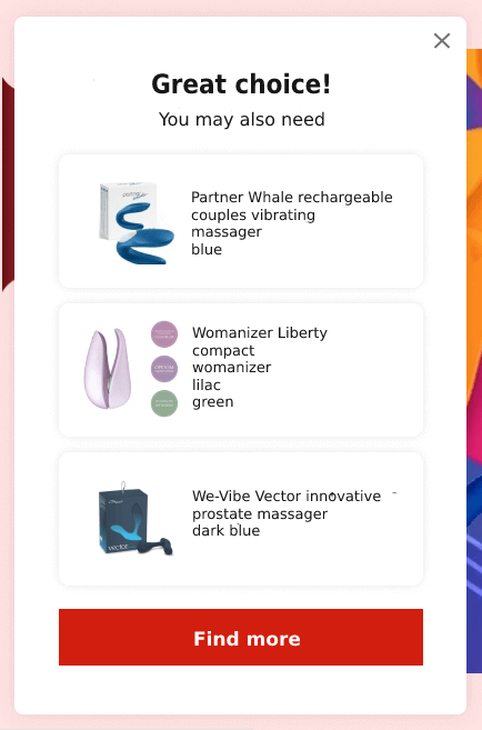
The result: Around 10% of visitors clicked on recommended options. 33% made an order. Complementary products pop-up brought +3.5% revenue in a month.
Pro Tip: Pay attention that there are only three recommended items visible on the screen simultaneously. Why? To demonstrate the offered item in detail with the optimal space for an image and description. If your products don’t have many details to show, place up to 5 items in a popup.
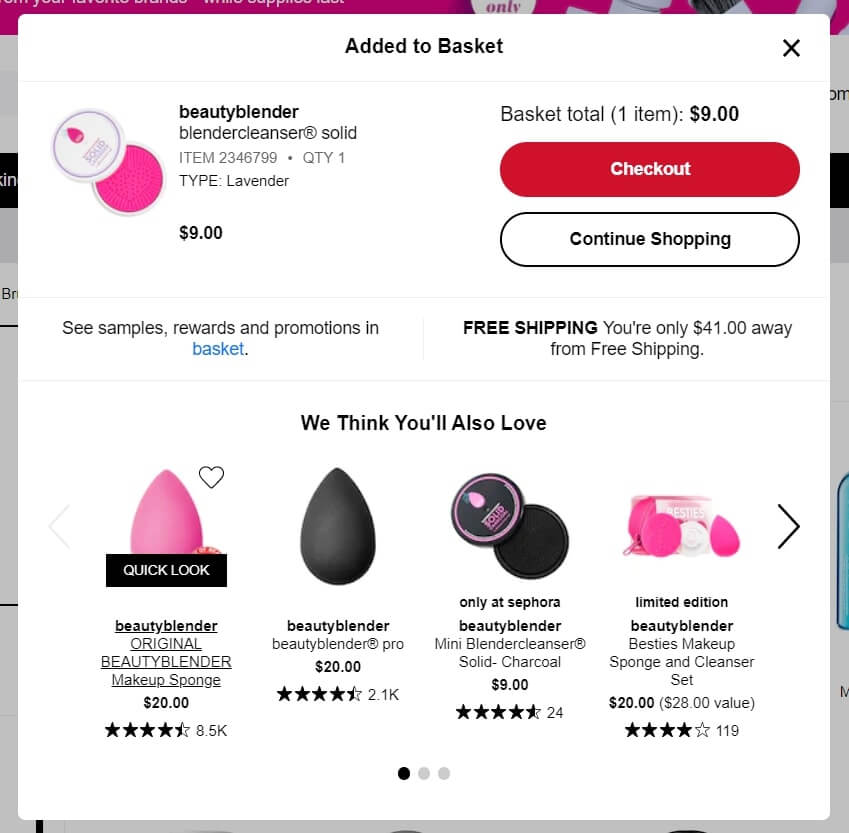
#12 Sephora cosmetics store increases this tactic effect with a free shipping opportunity
Just look how this “You’re only $$ away from free shipping” engages you to add something more to a shopping cart:
Show useful information in-time
We won’t talk about “Cookies agreement” or “Select your country for shipping” pop-up windows. You know these pop-up ideas for sure.
Sales Strategies for Online Businesses >
Marketing notification #13
It’s way more interesting to follow the idea from Zappos shoes store of out of stock pop up:
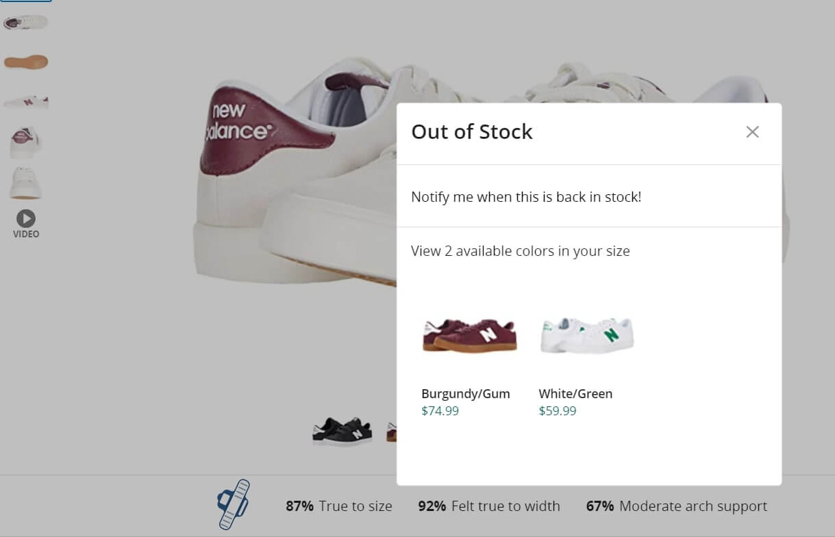
Of course, you can just cross the missing items in the list so that users won’t click it. But in such a way, you lose the opportunity to communicate with potential customers. What if they are ready to consider an alternative pair of sneakers? To save their time, offer similar in-stock options in a pop-up window.
#14 Generate some heat for the website guests via customers activity pop-up notifications like Cosmetic Capital does
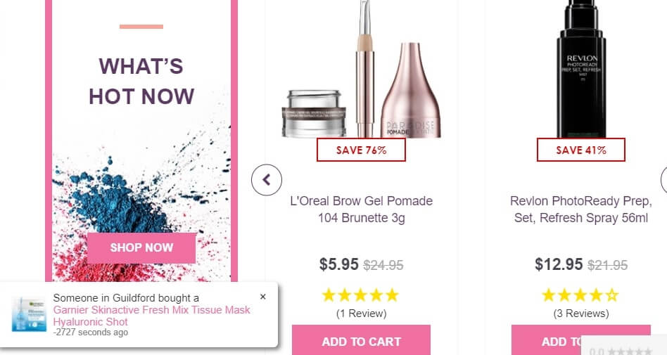
If the visitor stays on the product card or sale landing (hesitates about a purchase) for more than two minutes, it is good to notify somebody that somebody has purchased it right now.
Pro Tip: It looks suspicious when such messages pop up in precisely one minute. The pop up timing should be different. Say, 1st pop up after two minutes visitor is on a website, 2nd ─ after three minutes, 3rd after 30 sec, and so on.
Want to get a free marketing audit?
Let’s schedule a 30-minute call and find out how to:
- Improve your website conversion.
- Grow your ROI/ROMI with proven hypotheses that fit your audience.
- Optimize or launch ad channels without additional budget.
- Decrease SLA workload by saving their time on lead processing.
Review of the best pop up ideas from SaaS
To engage users to register in the service, try a demo, subscribe to the newsletter — there are so many examples of how services use pop ups. Let’s analyze the best of the templates.
Tricks You May Not Know >
Qualify leads with multiple steps email capture pop-up window
Lead qualification # 15
If you need to go deeper into lead qualification and get more information about everyone visiting your site (to offer the best deal for them) — launch the whole series of pop ups. Just like KlientBoost — a performance marketing agency did.
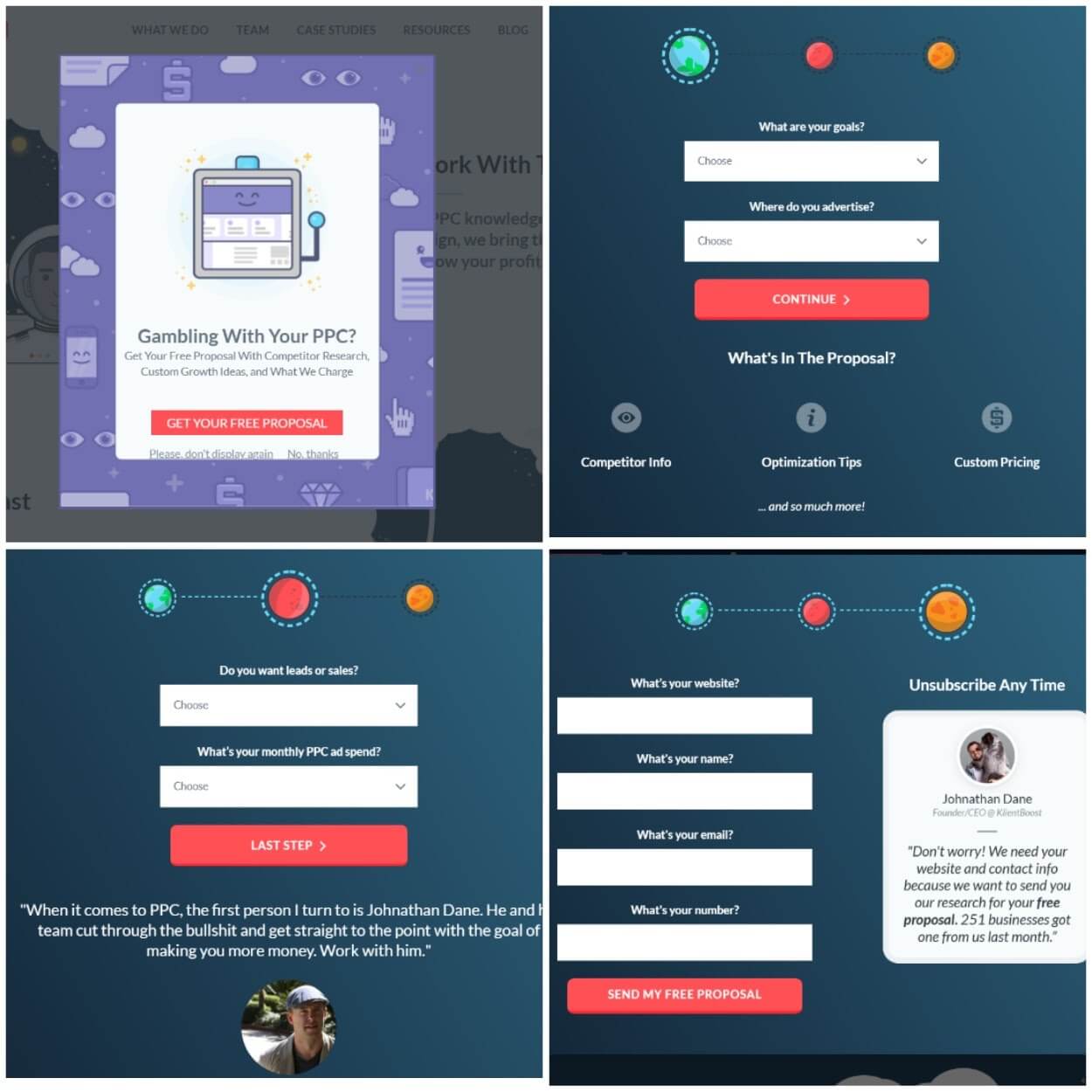
The result of the pop-up series is collected emails and a portrait of the visitor for further communication.
Marketing popup #16
Don’t like so many windows? Try a list of options pop-up format.
This is how Circles.life ─ a digital telco service asks its guests: what they didn’t like when leaving the website.
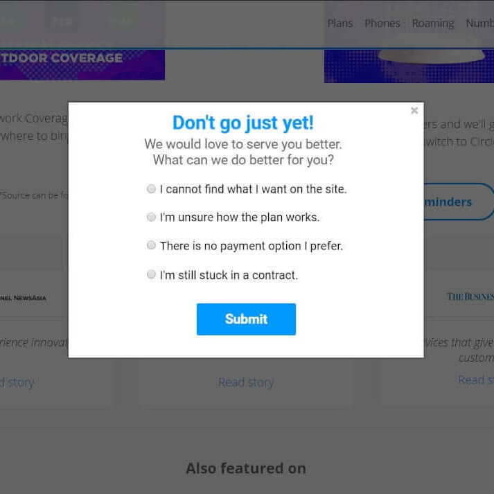
In such a feedback pop up, you can also ask what they are looking for, what professional sphere (or type of company) they belong to, etc.
Increase conversion rate with these popup examples
Ooh… Here is such a big field for experiments. This type of pop-up is aimed to increase everything that can be increased:
- sign-up conversion rate;
- conversion to payment;
- brand awareness;
- WOM marketing effectiveness, etc.
Chanty full-screen notification # 17
This is a full-screen pop-up that encourages you to sign up and shows the advantages you’ll get as an early adopter of Chanty — all-in-one team collaboration service:
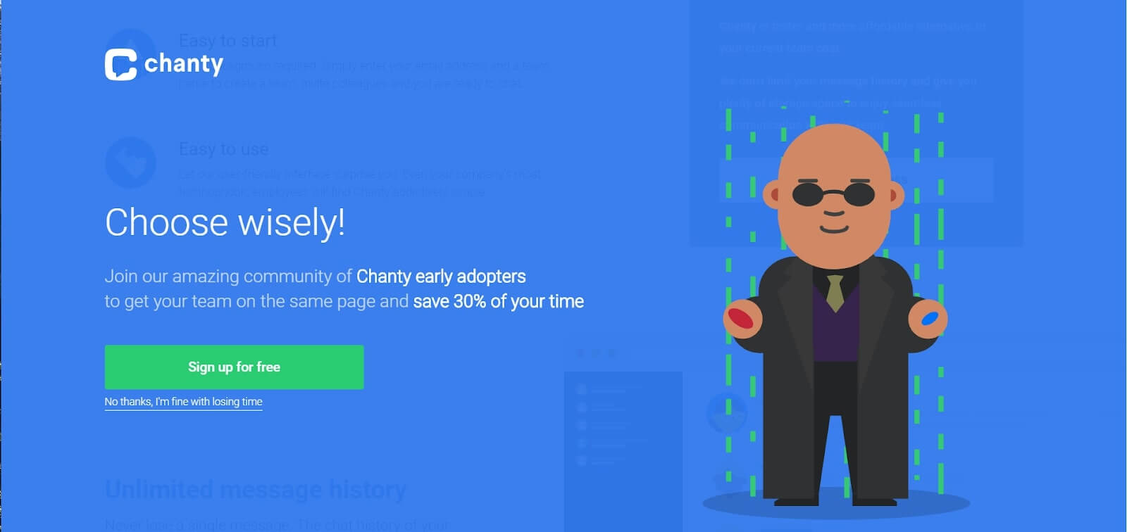
Understandably, a product that offers services can’t be visualized in an aesthetically attractive manner. Thus, Chanty uses the Morpheus character for a “choice” idea visualization. The first element that got users’ eye is a large header. But the main idea is a bit lower — bold text with special status and a % of a possibly saved time.
IQ Option + Dashly >
Marketing popup #18
Remind your visitors that there’s a chance to try your products for free. That is what myRealPage website building platform does — you trying to leave triggers the pop-up:
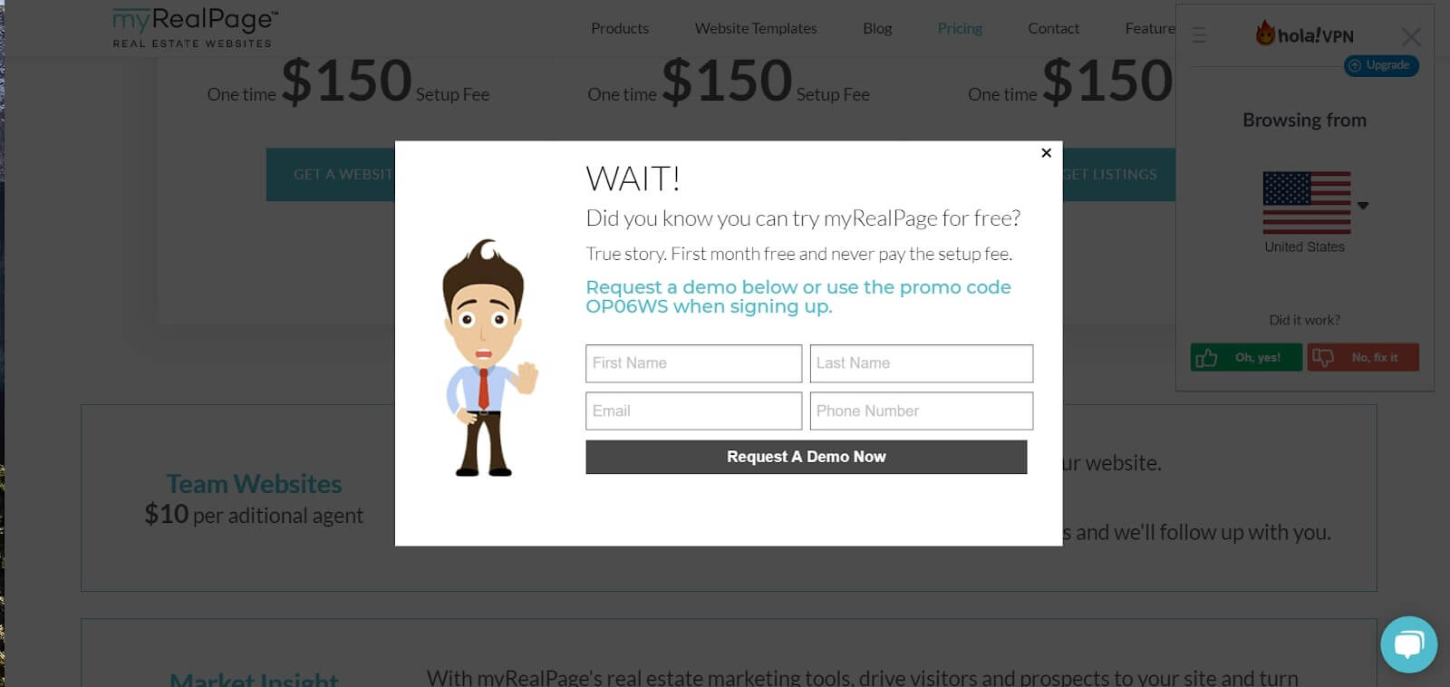
Exit intent pop-up catches them with an offer too good to pass up ─ a free trial period. You’d say everybody does, nothing new. But visiting their pricing page, you won’t find a free plan.

Add to Chrome offer #19
Smaller, smaller, even smaller. Datanyze ─ a tool that captures comprehensive information on your leads, doesn’t hide freemium. They use a small side pop-up to emphasize this opportunity for visitors:
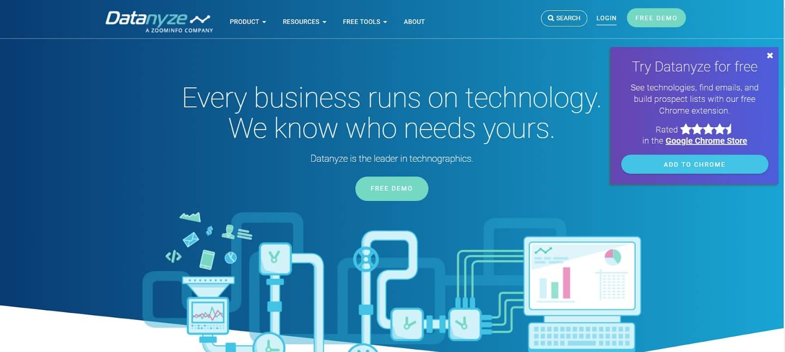
This pop-up offers to add a Chrome extension and use a tool for free. Pay attention to how they prove the extension reliability with rating stars from Chrome store.
Marketing popup #20
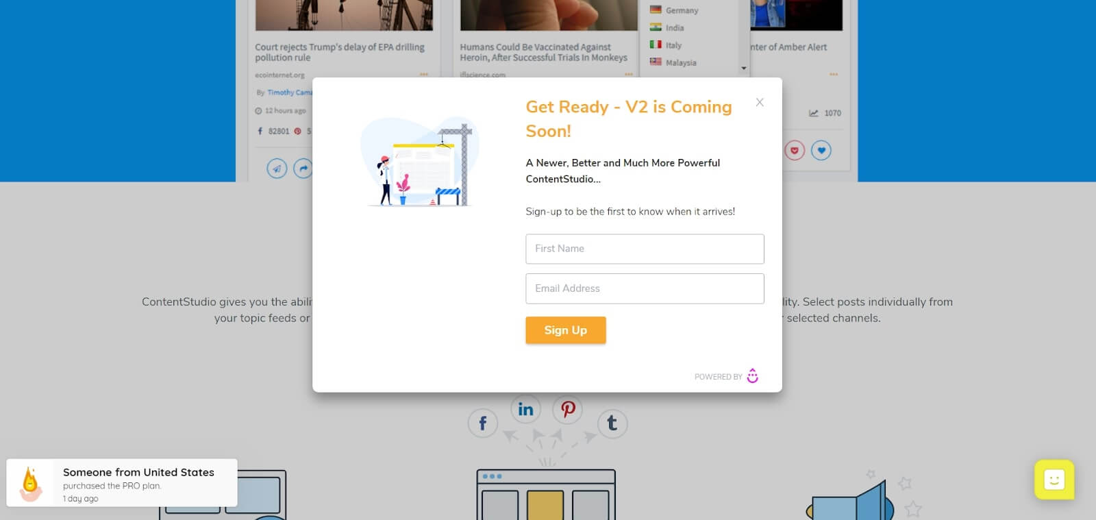
If you have an update coming soon — whet everybody’s appetite with a pop up.
Intrigue visitors with an opportunity to be the VIP users of your soon update. Just like ContentStudio, a content discovery tool did in this pop up:
Marketing popup #21
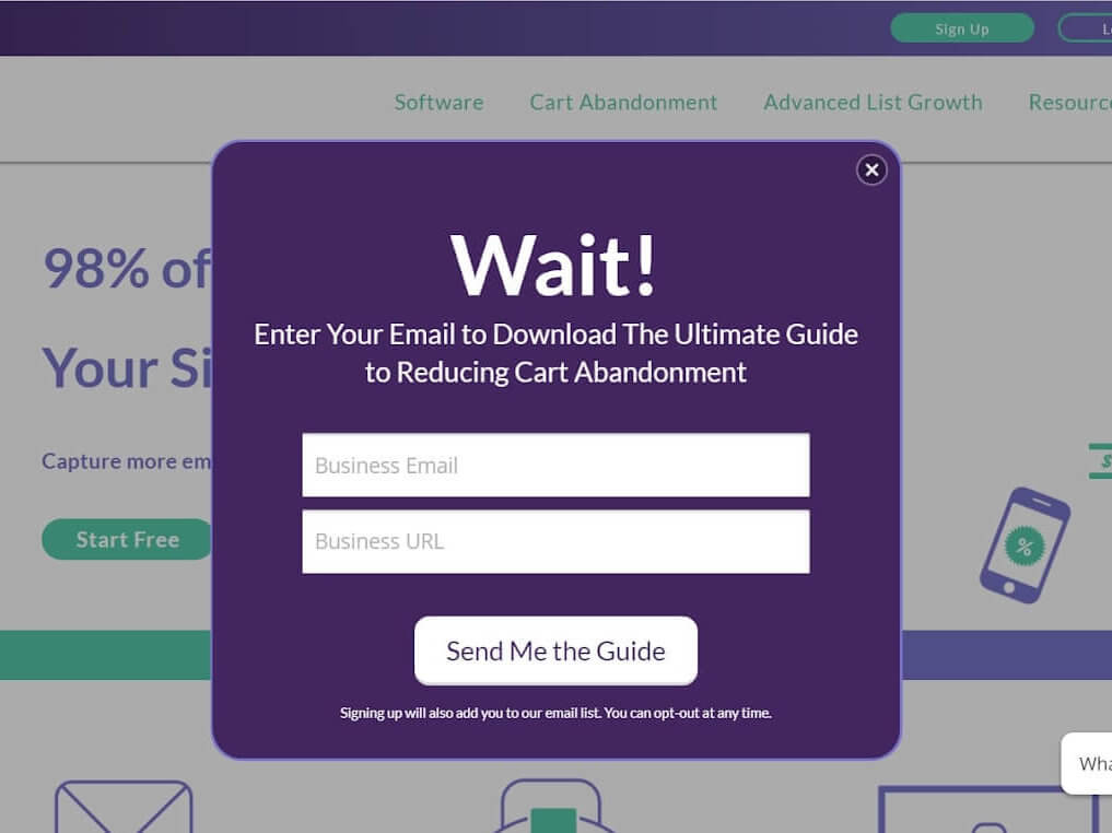
Another good idea is to illustrate the product’s value in a pop-up is to show it through a real situation starring a visitor. Just look how OptiMonster – a digital platform that offers pop up, implemented this tactic:
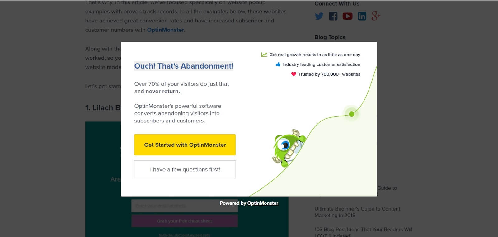
One of the jobs their service does is reducing the cart abandonment. And this pop-up is an excellent demonstration of the value they offer.
and How to Use It in Practice — Short Guide >
Popup #22
Steer clear of standard pop ups. Interact your visitors — they’ll love to play!
What’s something you don’t expect to see while scrolling through webpages?
- a quiz
- a lottery
- a guessing game, etc.
Come up with something that no one did before. Conversions will pleasantly surprise. Remember Circles.life feedback pop up? This time they offered visitors to play:
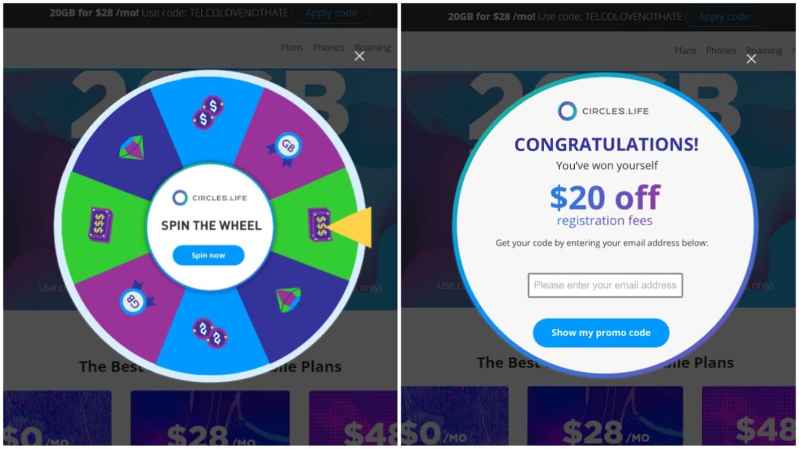
Circles.life offers you to spin the wheel and get a prize.
Pro Tip: If you want your visitors to have only one chance to win — just show the pop-up only once (you can do this in the pop-up settings).
Popup #23
Good offers are always a great idea — people love to save. Just remember that visitors have to understand what your product is about and why they need to pay for it otherwise, even a good discount won’t help.
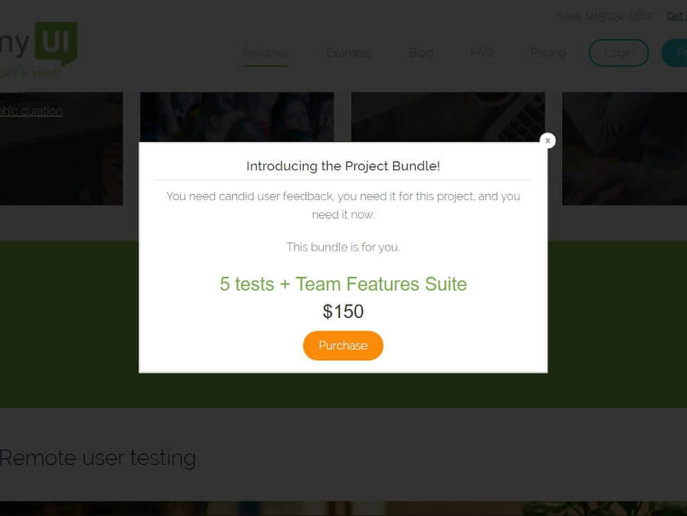
TrymyUI’s — Usability Testing Service shows unique offer pop up and highlights the most valuable info: offer, price and CTA button.
Want to get a free marketing audit?
Let’s schedule a 30-minute call and find out how to:
- Improve your website conversion.
- Grow your ROI/ROMI with proven hypotheses that fit your audience.
- Optimize or launch ad channels without additional budget.
- Decrease SLA workload by saving their time on lead processing.
Website popup examples to reactivate users with a special offer
A pop-up can not only collect personal data and make visitors sign up. It also has a strategic mission — activate, involve, and return visitors back on track.
Popup #24
Traditionally, starting with a “huge” website popup examples — HoldOnStranger (a marketing solution for e-commerce sites) is ready to become better for you. You didn’t find a needed feature — just drop them a message in a pop up.
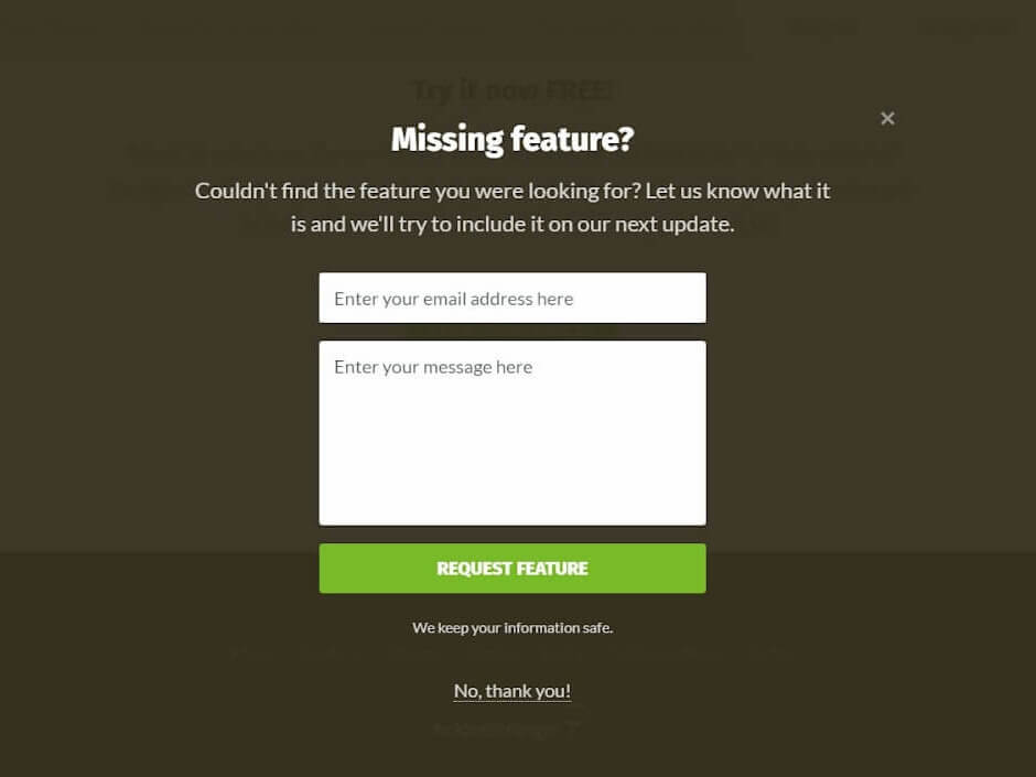
HoldOnStranger retention pop up asks visitors what a product misses fitting their requirements. It can be an excellent start to a long-lasting friendship where a user feels that a brand improves the product specially for them.
Popup #25
You can stop visitors from reading by showing them essential video content — watching videos may be more interesting and more effective than reading:
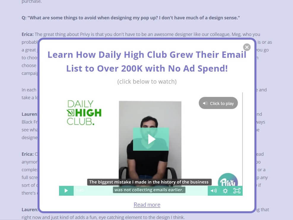
Privy pop up with a case study video in it — rare and valuable content.
Start long-lasting relationships with email newsletter subscription
Popup #26
When you visit a site of a Canadian author and blogger, Danielle LaPorte you’ll be welcomed by a pop up window with her photo with an offer to subscribe for a newsletter:
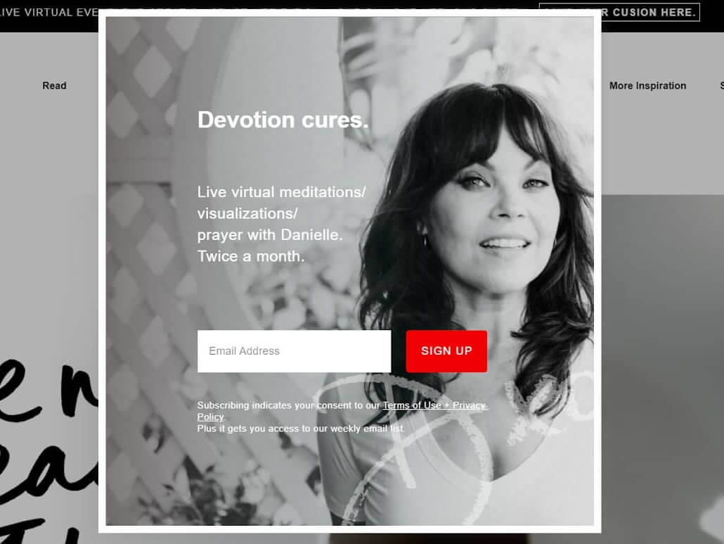
Since it’s a personal brand site, the idea of placing a photo on the pop up window is pretty good. It emphasizes the fact that you subscribe to a real professional’s emails, but not a company.
Pro Tip: People trust other people, not companies. Thus, visitors are more likely to share their email in a pop up window if there is a face of the company on it ─ the person they can thank or complain later.
Popup #27
If you don’t have a face of the company yet, there is another way to get visitors’ loyalty and trust.
Ask their preferences right in the email subscription pop up window, like Greatdays Group Travel:
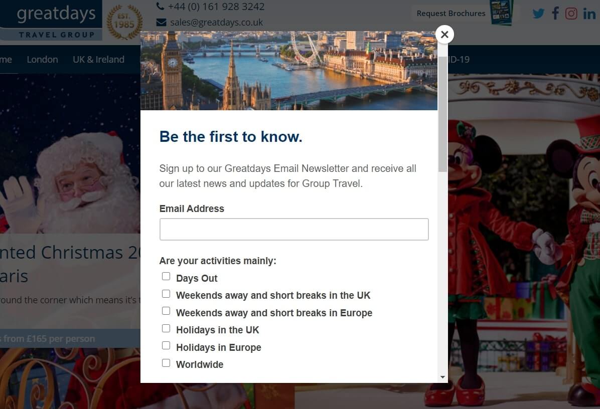
It is simple. The more relevant content, the higher conversion it has.
Popup #28
Sign-up pop up frequently appears while reading some blog articles or eBooks on a website.
One of the most remarkable ways to involve visitors is to let them read an interesting article only in the middle and then offer to sign up to continue reading.
conversions of each funnel stage and get $9000 in 30 days >

Pop-up #29
Omniconvert ─ a conversion rate optimization platform announced its event with a bright pop up in the bottom of the page:
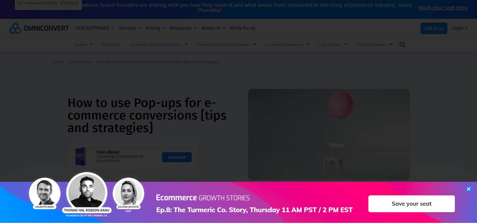
Look how they highlighted experts ─ the key reason to visit this conference.
Collect contacts to make personal communication further
Usually, such an email capturing pop-ups appear after a certain trigger:
- spending some time on the website,
- scrolling the page to the bottom
- trying to leave a website.
The main point here is that people are more likely to give their data in exchange for some valuable content. That’s why examples like that are popular and effective.
Want to get a free marketing audit?
Let’s schedule a 30-minute call and find out how to:
- Improve your website conversion.
- Grow your ROI/ROMI with proven hypotheses that fit your audience.
- Optimize or launch ad channels without additional budget.
- Decrease SLA workload by saving their time on lead processing.
Example #30
To leave visitors no chance to ignore an email guide Lilach Bullock a business coach, uses a full-screen pop up window:
Example #31
If you don’t want your pop up to fill the whole page space, you can go for a standard size pop up, like these from Privy ─ the email marketing platform for Shopify & Wix stores:
In Dashly, we call it a big pop up. This leave intent pop up has an additional site URL field. Thus, the service collects additional info about potential clients, their email and other contacts, converting traffic into leads.
Example #32
The next one is a small pop up from ProfitWell subscription software service:
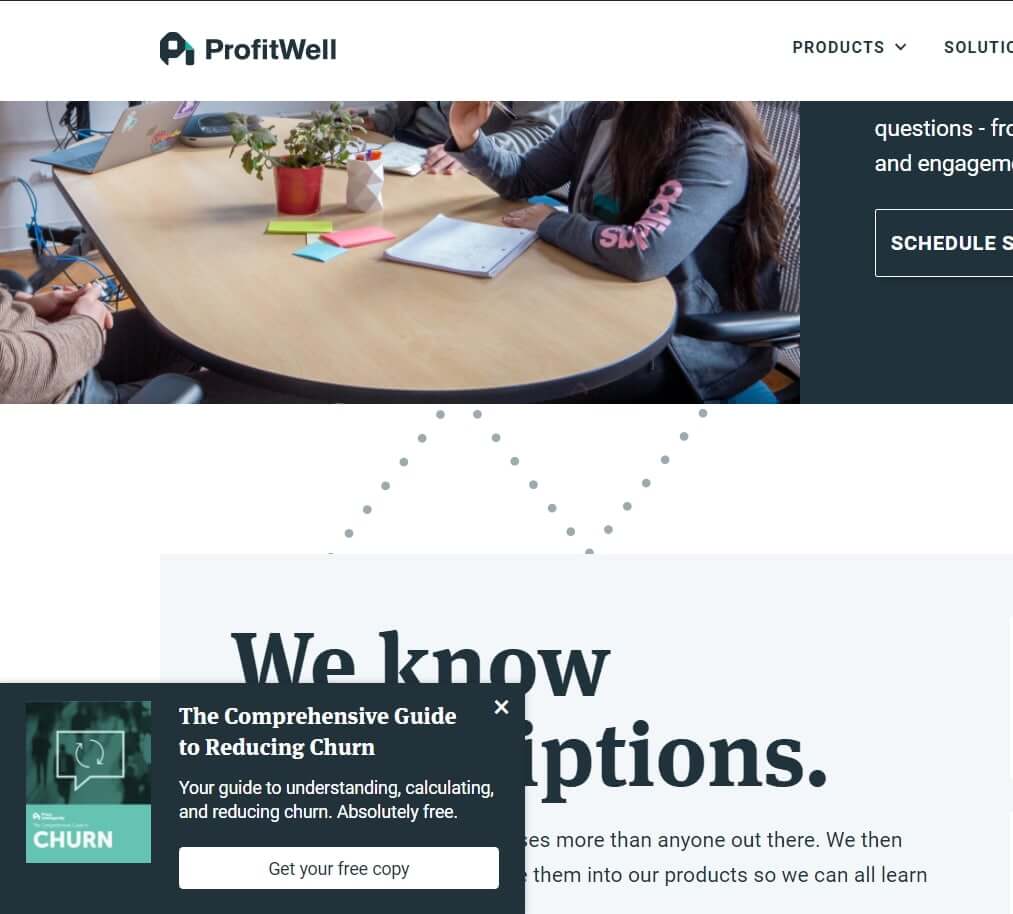
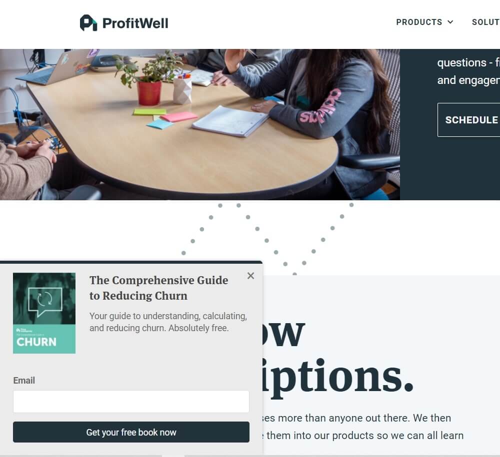
This two-step type of lead capture pop up window asks for email only when clicked on.
Example #33
If you want to add more interactivity, make your pop up move, jump or blink like Lemonstand’s one:
But be careful, this may distract your visitors. Anyway, you’ll never miss such an active email capturing pop up on website-building tools and hosting platform’s site.
If you don’t have any guides or docs that may be sent or downloaded, you probably have a blog or an email campaign with all product updates. Interesting things there, right? Offer to subscribe to your newsletter and keep up.
You can show this kind of pop-up only on your blog, not on the main site page — just select the needed settings in Dashly.
Thanks! Your map with ready-made campaigns is already in your inbox
Examples of Window Pop-ups on Blogs
Example #34
Pop up doesn’t need to have a button or an input field to be a good one. Thus, Spotify small side pop up redirects to another article:
An interesting tactic to improve visitors’ behavior on a blog.
But if you are a fan of classic, in Dashly, you can make a pop up with a field for an email or phone number, with a button, with a text field, or just a pop up with no additional fields.
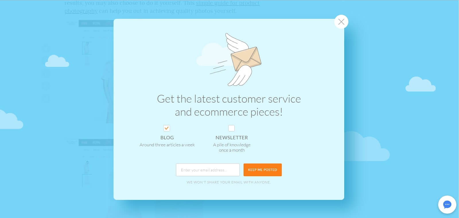
Free content pop-up #35
There is a tradition to offer blog visitors to subscribe for a brand newsletter on a main blog page:
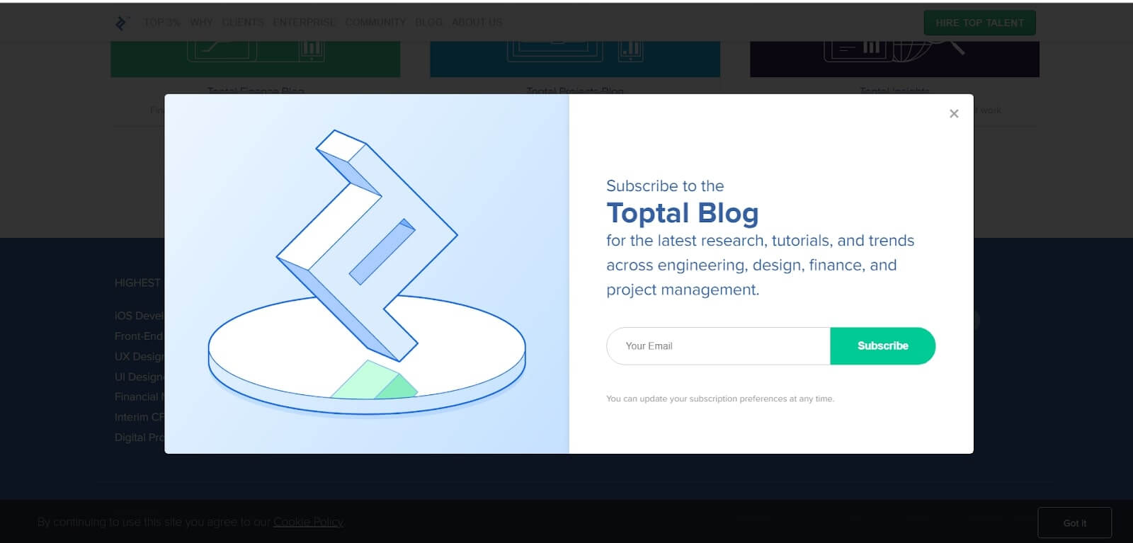
A simple two parts Toptal (a freelancing platform) blog subscription pop up with a header, email field, and CTA button.
Overlay template pop-up #36
In addition to these elements, GetResponse, an online platform for email marketing networks, asks for a visitor’s name.
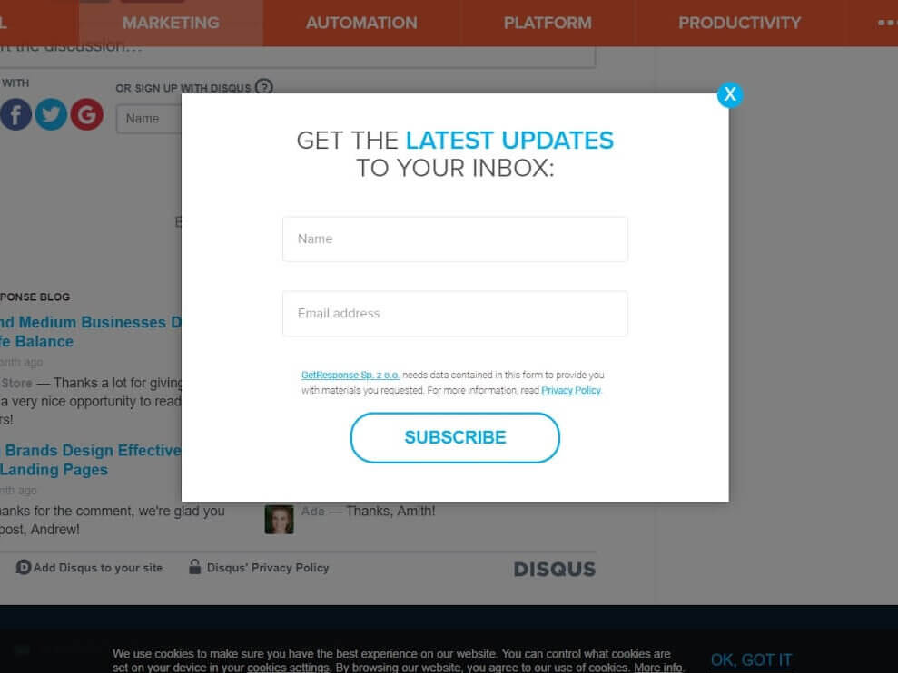
GetResponse big email subscription pop up on blog
You can take more out of the pop up and add some additional fields (ex. name, company name, phone number, etc.) Or even add a little qualification to see what your leads are interested in, segment them and boost conversions.
Trigger popup #37
Just like LiveChat.Inc customer service platform did on its blog:
LiveChatInc pop up with qualification
By following this email subscription case, you can offer visitors to subscribe to company news & product updates, sales, events, etc. yes, the number of the newsletters will reduce, what can’t be said about its quality.
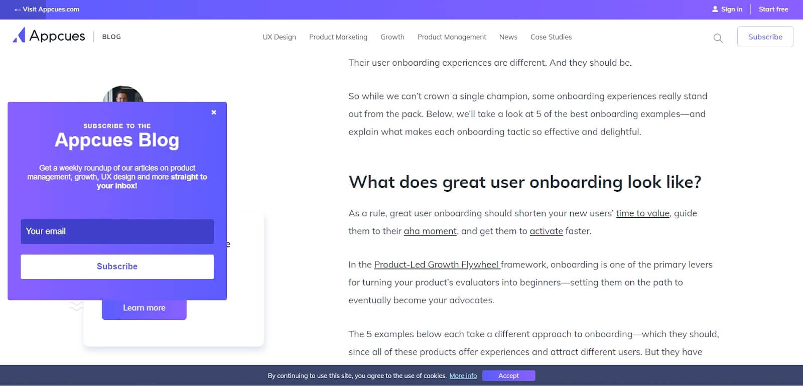
Example #38
If you don’t want to interrupt the reading process, place an email subscription pop up near the text. Appcues the Product-Led Growth Platform also likes this idea, so it offers readers to get weekly newsletters in the left corner, but not over the text:
Now you see that you can do whatever your fantasy can come up with. Especially since the moment, we provided you with an instrument — Dashly Pop-up Builder. It has a visual editor to add buttons, pictures, and fields for email addresses, phone numbers, or text to a website pop-up, depending on your goals.
You need only 5 minutes to create your first popup in Dashly:
- Design the popup content elements. You can customize each part of the chosen template or create one from scratch.
- Choose the trigger. There is a list of actions (events) visitors perform on the website. For example, page visit. In Dashly Popup Builder, you can set it as a trigger when this popup window is sent.
- Define the audience. You can easily choose to apply segment filters in the popup creator — Properties, Events, and Tags.
- Configure the right time & place where your visitor will see the pop-up on the website.
7 days of free trial. No credit card required
Drag, drop, play, rock
This article was first published on January 16, 2019. December 8 2024, we’ve updated it.
Read also
- The best way to collect emails: 5 top-notch methods unveiled
- 3-step guide on inbound lead qualification: how to qualify inbound leads on autopilot
- Choose your ideal lead nurturing platform: Top 10 software tested by experts
- How to implement user tracking on website: guide, tactics, and tools
- Top 10 user activity monitoring tools: tracking features, price, cons and pros
- Top 10 customer segmentation tools to personalize customer communications
- 12 best AI marketing tools to automate everything [expert edition]
- Top 12 omnichannel marketing tools for your cross-channel campaigns
- 7 best email capture tools: features and pricing compared for 2024
- Top 20 best website tracking tools for effective work with visitors


![21 proven tools for your 2025 marketing tech stack [Recommended by market experts]](https://www.dashly.io/blog/wp-content/uploads/2022/08/martech-stack-999-720x317.png)

