How to achieve 19,3% order increase with pop-up campaigns: the success story of Mofy.life
Valerie is a digital marketer at Mofy.life. It’s an online service for creating photo books — a wonderful way to keep memories live. Valerie decided to share their story with us: how the company uses pop-ups to generate more leads and increase the Conversion Rates.

About Mofy.life
Mofy.life is a platform with a special mission: we help people save their memories in the form of photo books and pictures.
We have a small marketing team. We already used Dashly marketing tools before, and we love the platform immensely. As a person responsible for the performance marketing, I work on the campaigns and analyze their efficiency.
I remember how I began configuring our first pop-up campaigns myself as it would help me understand the philosophy of the platform and be able to delegate the further tasks properly.
The challenge
Back in 2019, we redesigned our website and modified the checkout page.
Previously a user had to sign up with their email or via social media to get to the photo book builder.
Why this approach was good:
- we collected qualified leads;
- we ran triggered email campaigns using Dashly (those included links to photo book editing and reminded of incomplete orders).
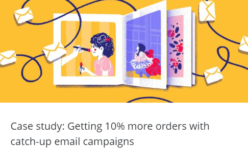
Mofy.life used Dashly to run their email campaigns. You can read more about the results here:
But we realized it wasn’t enough:
- some less interested users were leaving the website as they didn’t want to share their contact details;
- personal data protection was not quite perfect.
That’s when we decided to take a risk and redesign the website. What we did was removing this stage from the start of playing with the builder. From that moment, all users could easily access it. As a result, a whole lot of new users visited the builder. Yay!
We made the website more convenient by removing just one step. However, the quality of the generated leads decreased along with the Conversion Rate to completing an order. At that time, users didn’t receive any triggered emails.
Tasks we set
At that time, we were thinking about how to “patch up the hole” in the funnel, generate qualified leads again, and indeed boost orders. Even now we continue mastering this, our marketing team is so into it! We constantly brainstorm new ideas, and seems like we’re not going to rest.
1st campaign. 19,3% increase in orders by retaining users who attempt to leave the website
I’ve always hated pop-ups. They annoyed me on any other website. I found it hard to imagine what would have to happen for us to start using them.
This is how we came to a priceless insight: be guided only by actual results to implement features. Campaigns may work even if you doubt that they can do so. That insight was a game changer, indeed.
We selected the “Exit intent” as the trigger to run our first pop-up campaign. We got nothing to lose at that stage. Even a user who disliked and closed that pop-up couldn’t make the Conversion Rate worse than we had. That’s what I thought when I finished configuring the campaign.
One more thing. We desperately needed to personalize communications and segment users.
That was easy for us. The first thing we paid attention to was the user’s email. Why? To enrich the database. How could we get emails? With special offers. Secondly, we wanted to know the user’s device type to reach out to a bigger audience and finetune the pop-up. It had to look nice on both desktop and mobile.
Bringing it to life was easy with Dashly, so it took us just a day to get started.
We’ve decided on the three segments for a kick-off:
- Users trying to leave the website and we don’t know their emails.
- Users visiting from a mobile device who spend over 5 seconds on the website and we don’t know their emails.
- Users trying to leave the website and we know their emails.
Each segment was also separately targeted at visitors from different countries.
Segment 1. Users trying to leave the website and we don’t know their emails
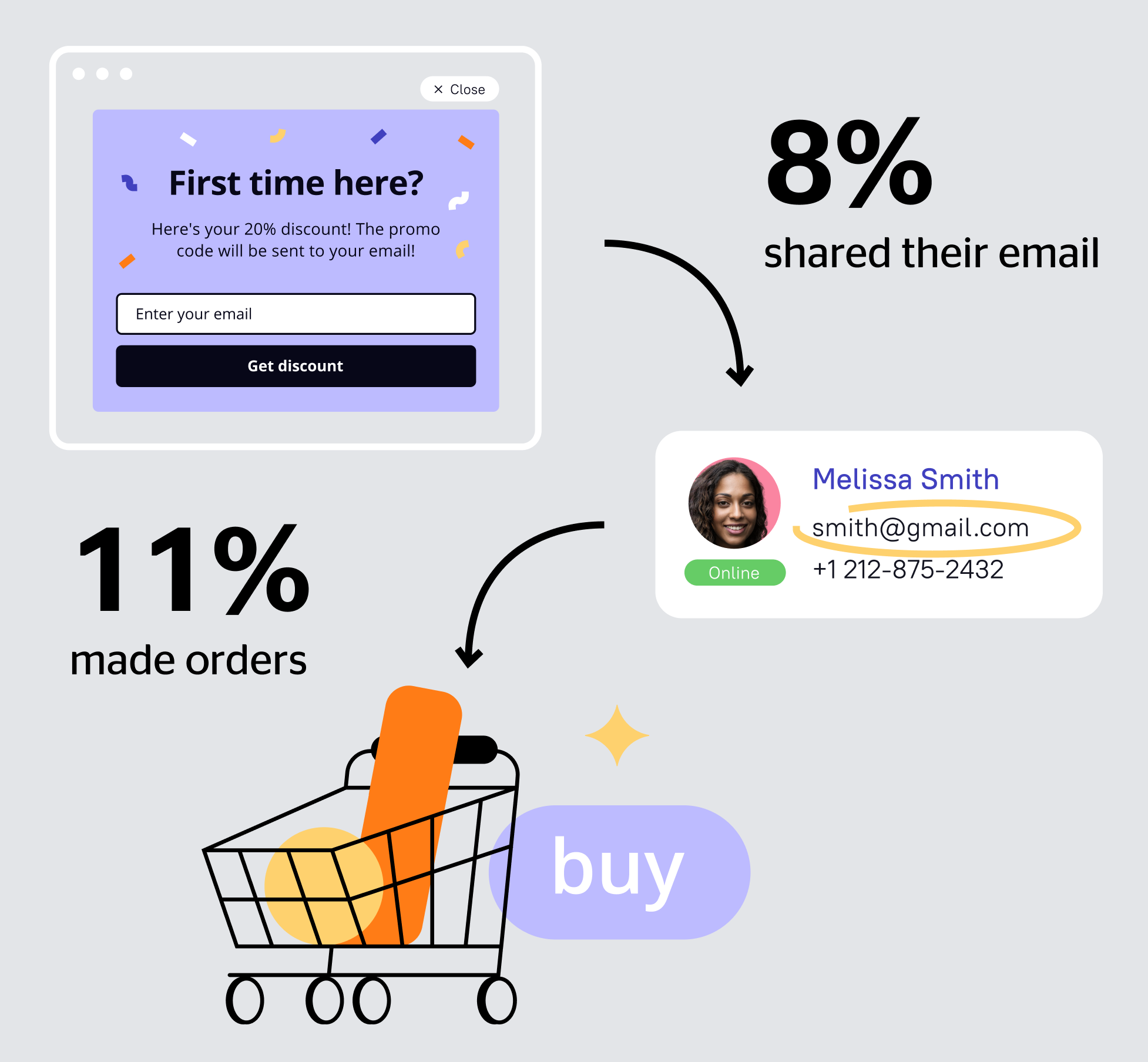
In our case, it means the following: if the user’s email is unknown, they have never ordered from us yet. So we assumed that a discount for the first photo book would appeal to the segment. Spoiler: we were right!
You can manually configure this campaign in Dashly. Just choose the trigger “Attempt to leave the website” and set the condition “email is unknown”. But for me, it was much easier to run the ready-made campaign for email capturing, so this is also an option.
We used the Dashly pop-up template for a quick start and launched the button color A/B test.
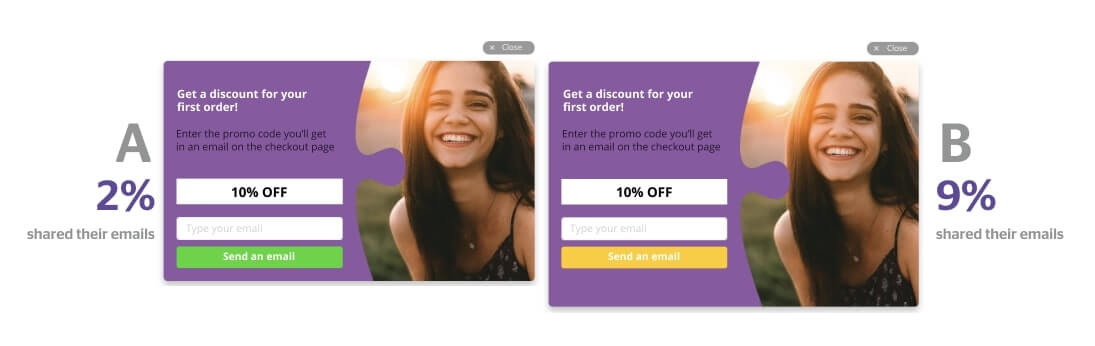
The results were quite intriguing. Only 2% of users who saw the option A shared their emails while 9% preferred the option B. I was very excited by these figures.
Even now I continue to run A/B tests: I test pop-up designs, offers, copies and messages. The outcome? The number of leads collected and the conversion rate to order busted the myth about the obtrusiveness of pop-ups.
Segment 2. Users visiting from a mobile device who spend over 5 seconds on the website and we don’t know their emails.
Take a closer look at this segment. You can see if a user is trying to leave your website on a desktop, but it’s impossible with a mobile device. Over 50% of our traffic comes from mobile. So remember this rule: configure a separate segment for mobile visitors. Don’t neglect this rule.
We’ve selected the “Session started” trigger with a 5-second timeout. Be sure to specify the condition “Device type = mobile”. For this segment, we chose a minimalistic style and tested the button text.
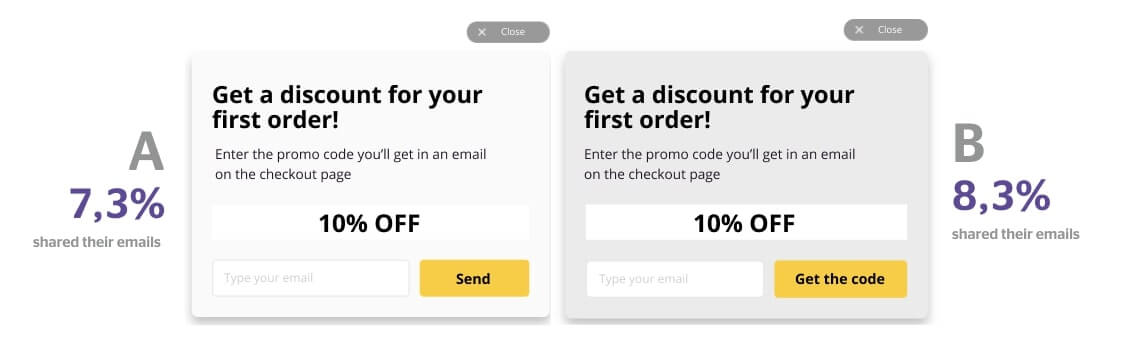
7,3% of users shared their emails after they saw the option A, and 8,3% of users preferred the option B. The difference in conversion rates is 1% (the “Get the code” option won). The moment users left their email addresses, they got promo codes via email.
I’d like to highlight some conditions that help improve the performance of this campaign:
- limited-time offer (we sent a promo code that could be redeemed during the next 3 days);
- the order of messages. We send emails on the first and the last days of the promo code “life”. This way we slightly push the user to complete an order, and remind them of ourselves. Later the users are added to newsletter campaigns which always includes useful and selling content;
- top priority: experimenting with email subjects and designs.
Here is an email we sent:
CTR of this email was 16,63%, I was surprised with this.
I guess the neat design, concision, and the only emphasis on the button helped this email gain such a CTR. By the way, this is a ready-made Dashly template that we slightly modified.
Monthly results for 2 segments
8% of users who saw the pop-up shared their emails with us, and 11% of them ordered.
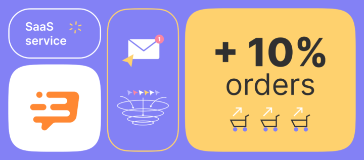
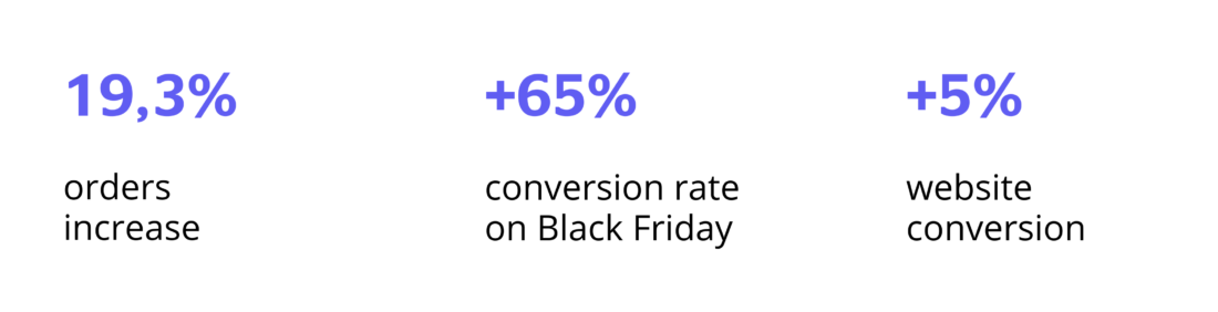
This added up to 19,3% of all orders during the analyzed period.
Segment 3. Users trying to leave the website and we know their emails.
We launched limited-time special offers to grab the attention of users who leave the website without sharing their emails. That was a part of the lead generation strategy.
But we weren’t going to offer a discount to users whose emails we already had. Mofy.life performs great email marketing activities with regular special offers, and a discount would disappoint users who just ordered at a full price.
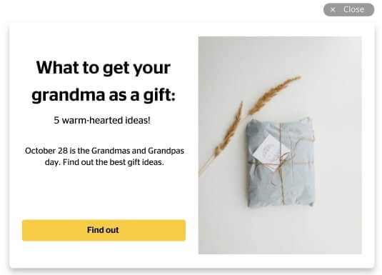
We couldn’t leave this segment with no attention as we could already taste the success. So we started sharing useful content, lifehacks, and customer success stories from our blog with this segment.
We regularly update our pop-ups to make sure our loyal customers don’t see the same content. Take a look at this example:
Monthly results
7,7% of users clicked the article link and 19,8% of them made their orders after reading the article! Remember: they were just about to leave the website. Isn’t that amazing?
Mofy.life’s case proves that pop-ups help generate more leads. Launch your first campaign with Dashly to try it yourself!
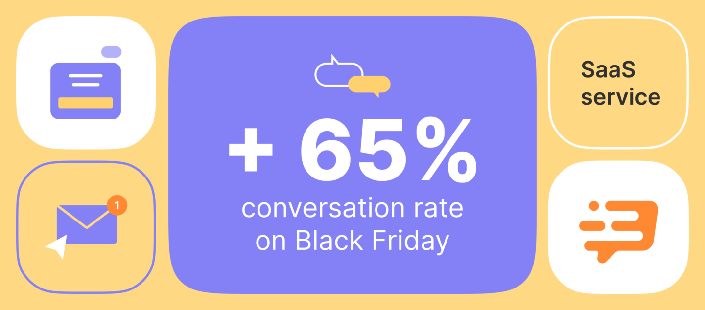
2nd campaign. 11% left their email in a promo pop-up on Black Friday
A user needs to enter a promo code on the checkout page to order a photo book with a discount. Informing about a promo using pop-ups would be boring and inefficient. But we also didn’t want them to leave the website and go to the email box to find the promo code.
So we decided to create both campaigns: show a promo pop-up with the promo code and email it to a user. It gave an opportunity to get back to the offer whenever they wanted to.
11% of users left their emails on Black Friday.
Our pop-up experience in a nutshell
Thanks to reworks and implementation of pop-ups, the conversion rate didn’t just restore to its previous numbers, but also increased. Speaking of Black Friday, the conversion rate in 2019 was 2x higher than in 2018!
Our main outtakes
- Pop-ups work. It all depends on how well you know your target audience and their needs.
- Personalize your messages and segment your audience as much as possible.
- The more relevant and useful the content is, the higher the conversion rates are. Even the details matter, such as the design which often depends on the season.
- Run as many tests as possible: if you find the perfect option (which works!), run a new one! Until you achieve the best results.
- Only test one element at a time to get trustworthy results .
- Configuring pop-ups, campaigns, and emails with Dashly is convenient. Don’t reinvent the wheel, use ready-made campaigns and templates.