A new era of the Inbox (and brand new design)
Today is a very important release. We changed colors, fonts and the way elements in the admin panel look. The biggest changes are in the Inbox section.
Inbox is used by about 54% of Dashly users. We never changed the Inbox section dramatically, even though there were some little improvements. Now the time has come!
We started from the conversation list and filters and made the input field expansible. Now meet the great redesign of the Inbox section.

Sides of agent’s and lead’s messages
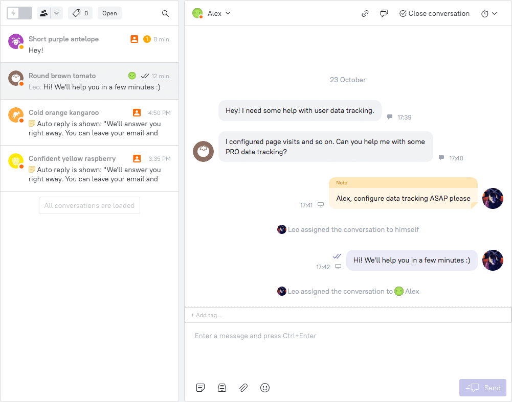
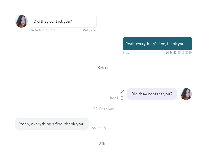
Remember the positioning of messages in the admin panel? Messages from your leads were shown on the right and agent’s messages were placed on the left. We had our own logic for such positioning, but some of you were struggling with it. All social networks were sure that the reverse positioning is the best.
Now all agents in the admin panel will see their messages on the right side, and lead’s messages are now on the left side. But again, it is not the same way as it is in group chats in Viber or WhatsApp.
In WhatsApp, for example, you see your messages on the right and messages of all the rest group members on the left. Now in Dashly you see your messages and messages of all other agents on the right and lead’s messages on the left. This was made because several agents can talk to one lead, hold a conversation, reassign it and leave notes. We couldn’t divide their messages, because otherwise, it’ll be harder to understand the problem and the way it was solved.

Layout of messages
Our main goal was to make the Inbox section look visually lighter with a friendly, trouble-free design, but hold down to the useful information displayed.
First of all, we changed the way messages look — now the background is much lighter and doesn’t look like buttons in the rest of the admin panel.
The layout of the messages became lighter as well. Now the message has only time and channel info next to it.
Moreover, we got rid of duplicating the agent’s profile picture, if there are several messages by this agent in a row during a short period of time. Now you’ll see the profile picture only once next to the last message.

One more nice change: we added an auto load of messages while scrolling the conversation history. Now you don’t have to press “Load more”, older messages appear automatically.
In addition, if you did more than two scrolls and the new message came, the conversation stays where you’re reading, not scrolling to the bottom automatically.
Message delivery & read statuses
Before this release it was possible to understand if the message had been read or not by the color — messages with a grey background were unread, with a white one — read. Such color usage may not be very clear to new users. That’s why we decided to go for a widespread method — check marks. One checkmark means that the message is sent, two check marks — read.
Division by dates
It is easy to get lost in a conversation if it is long and lasts for several months. To make the navigation easier, we grouped the messages within one conversation by dates. It also gave us the opportunity to remove the data from the message layout that was small and didn’t help to navigate.
Link to the original email
Your leads can receive different emails from you — triggered messages, manual messages and an email that duplicates a chat conversation. They can reply to any of these emails and of course, you will see this reply in Dashly’s Inbox section. To understand what this reply is for, you can see the original email (did you ever know that?). Previously, it was hard to find where the original email is hidden, now a link to it is displayed in the conversation right after the reply.

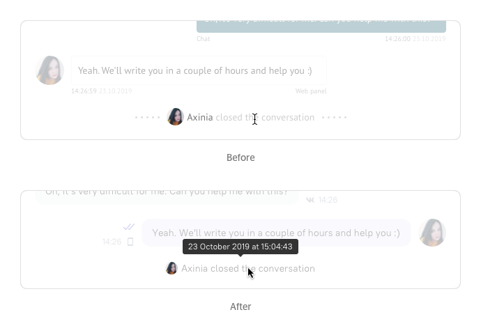
System messages
The most important thing about system messages is that now you can see when it was sent if you put the mouse cursor on them. It means that now you can find when the conversation was reassigned to someone or closed. And the design became much nicer 🙂
New colors in the admin panel
Not only the Inbox section has been changed. We updated the design in the whole admin panel. Colors, fonts, some elements — all are refreshed.
Сolor palette hasn’t been changed from the date of Dashly birth, so we were facing unsystematic designs and that really harmed the designers’ and developers’ work.
So these are the main goals we wanted to achieve with the new design:
- Get rid of rudiments in the interface
One element had several duplicates that were used rarely. We needed to systemize it.
- Optimize the pipeline
We needed to have strict rules and create a system to help designers and developers come to agreements faster.
- Synchronize designers and developers
Strict rules will help both designers and developers: elements may be reused, new design will be introduced faster.
- Upgrade layouts
We made the admin panel look more modern and convenient. We worked with the contrast, colors, buttons, fonts, etc.
There are not a lot of changes and they may seem very unusual at first glance, but they are made for your comfortable work and for your eye pleasure. Share your opinion about the new designs and the rest of our work — it is crucial for us, because everything we do is for you. ?
Read also:
👉 Live Chat Best Practices: 20 Hacks to Make Customer Service Better
👉7 Best Live Chat for eCommerce: Boost Conversion on your Website
👉 Top 5 live chat mobile app: find the best fit for your business
👉 Live Chat: How Online Chat Tool Can Help Your Business
👉 20 Best Live Chat Software for your website chat service
👉 Acquisition funnel marketing: Grow customer conversions at each step of user journey
👉 The top 15 inbound marketing tools: harness digital power and elevate your business
👉 10 best website personalization tools to deliver top-notch visitors experience
👉 7 best email capture tools: features and pricing compared for 2024


![Chatbot for business: The complete guide [2026]](https://www.dashly.io/blog/wp-content/uploads/2022/05/ultimate-guide-to-chatbots-720x317.png)

![Top 10 Best Custom Chatbot Platforms for your website [+AI]](https://www.dashly.io/blog/wp-content/uploads/2020/06/cover-1-720x308.jpg)