Fresh insights from 3 email onboarding campaigns of SaaS brands to educate your users

The job is done: you’ve set all the necessary pop-ups and tooltips on the website to help new users start using your product. (We wrote about this in the first part of this article.)
Is it the end?
No.
It’s impossible to teach them all the needed info during the first session. There is when email newsletters come into play. We’ve analyzed how SaaS companies from the first part onboard new clients with an email nurturing campaign.
After reading this article, you will:
- Get insights on your competitors’ email onboarding scenarios.
- Learn how to launch an automated email onboarding campaign with no code.
Enjoy?
Thanks! The first email is already in your inbox

Grammarly
This is the online writing assistant I use to make this article sounds better.
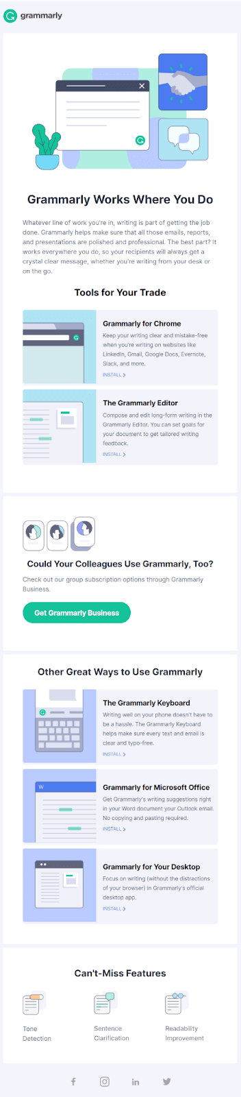
Onboarding email #1
Grammarly sends its first email a day after sign-up. A list of arguments about app use cases, saved time, and perfect image offers subscribers to set up Grammarly browser extension.
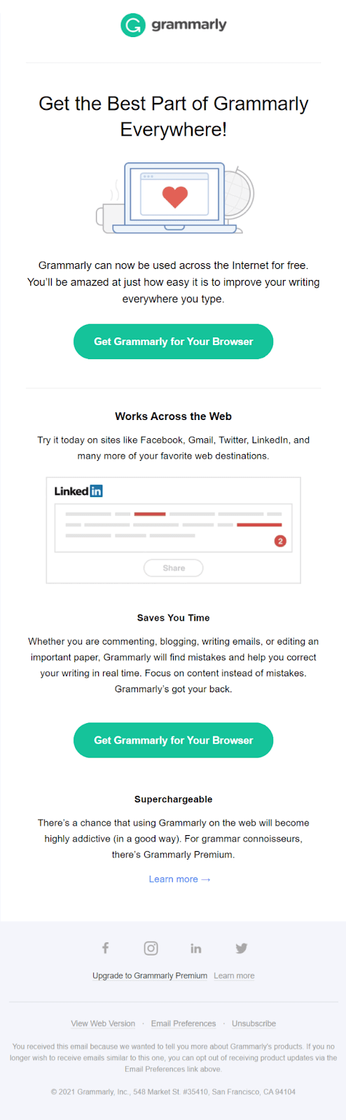
What we like about this email:
- Each of the text blocks calls to the same action ─ Grammarly extension for browser installation. It sounds the same on every CTA button.
- Short text part is full enough to understand the tool’s advantages.
- Uniform design style of the email newsletter and website.
What could be better: Personalization, its absence, to be exact
Onboarding email #2
The next day, Grammarly sends its second email with a big picture of the man with giant hands, inviting you to try the interactive demo.
Read also: How online services use Dashly
Personally, I see two ideas behind the “big hands ─ fast typing” metaphor: it’s your fingers that grew in muscle after fixing your illiterate writing because you don’t buy Grammarly Pro; it’s Grammarly users and the reason for their mistakes, or it is Grammarly app projection fixing your illiterate writing?
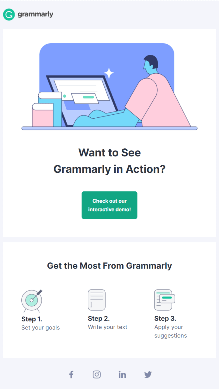
No doubt, a demo is the main part of this email. It is complemented by the short tool usage guide.
What we like about this email:
- The way Grammarly cares about subscribers’ time with its short but meaningful text blocks and clear CTA.
- “One email ─ one button ─ one CTA” principle. They placed the CTA button in the first block, which has the highest chances of being seen.
Onboarding email #3
The third day after signing up, you’ll receive a list of Grammarly tools and use cases you had any idea about.
It is way informative. For example, I haven’t known about the Grammarly keyboard. In terms of the tool use cases description, even the block with the promo of Grammarly business plan looks native.
What we like about this email:
- The short announcement of the next email with features.
- Tactic to add CTA button in the beginning or in the middle of the email where it has more chances to be seen.
Onboarding email #4
“You waited ─ we sent” here is how I see the next email newsletter introducing features you’ll get access to when paying for Grammarly Premium.
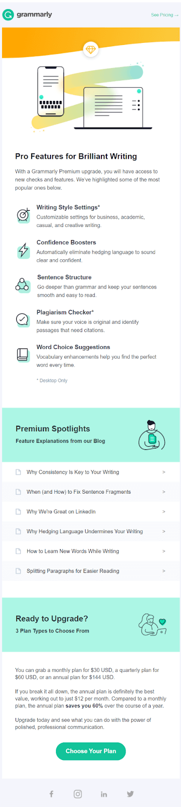
Description of the pricing plans is a logical finish of this email, engaging subscribers to enroll from free to a paid plan.
What we like about this email:
- Its justified long size. The structure is clear, and each of the following parts of this email complements and strengthens the previous.
What could be better: reduce the number of blog posts.
Onboarding email #5-6
Grammarly doesn’t leave its attempts to enroll me into Premium plan. This time they brought out the big gun ─ 40% off.
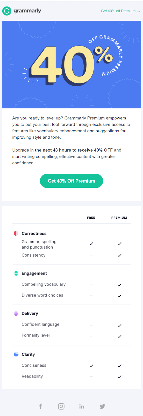
The comparison of the Free and Premium plan almost convinced me to pay. But I don’t give up ignoring to see all the emails from the Grammarly onboarding campaign.
Read also: Cross-sell, Upsell & Bundles: Sales Strategies for Online Businesses
In two days, Grammarly reminded about the discount with the same email but in different color:
What we like about this email:
- Table of plan features comparison.
- Descriptive CTA.
- Email copy is focused on the one goal ─ Premium plan enrollment.
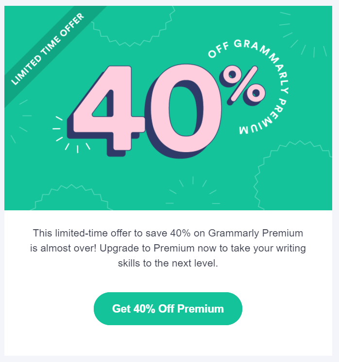
This email had a “last chance” title, by the way. And it was really so.
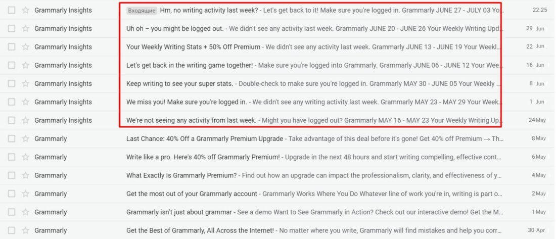
Onboarding emails #7-13
After this, once a week I received my Weekly Writing Stats. Since I’m a lazy ass, there is an absence of zeros in this email:
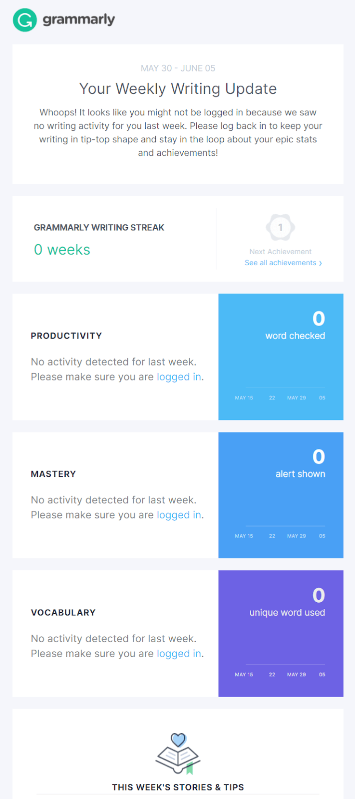
The second part of this email is more informative. The best blog posts and new doze of Premium plan arguments make this newsletter interesting to read:
Do you remember the 40% off email? It had a last chance title by the way.
Glad I ignored it.
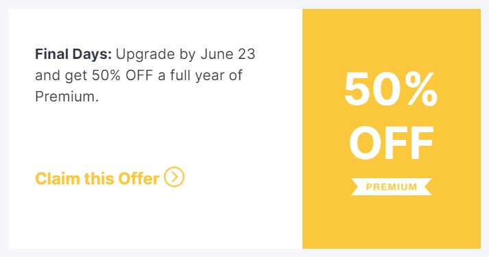
Because in one of these writing stat newsletters, Grammarly offers 50% discount:
What we like about these emails:
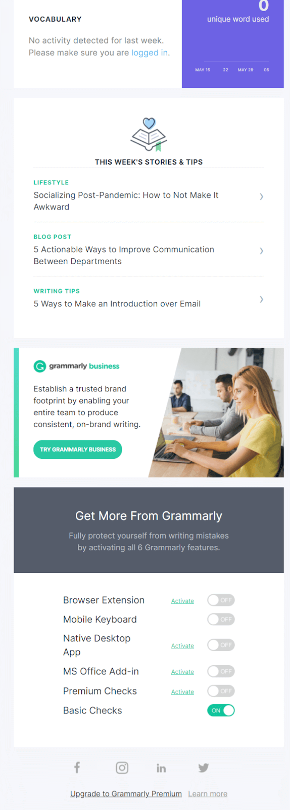
- The writing progress stats idea is informative and engaging.
- The combination of informative and promo content within one email.
- The way they save resources by using the same email template and design, changing colors and some images.
Short summary of Grammarly onboarding email campaign:
- Welcome email with CTA to install the browser extension.
- Demo invitation.
- Grammarly use cases and tools description.
- Pro plan enrollment promotion.
- Pro plan enrollment promotion 2. 40% discount.
- Pro plan enrollment promotion 3. Last chance to get 40% discount.
- Writing statistics once a week.
Read also: Fight invalid emails while saving conversion rates
Basically, the Grammarly email onboarding campaign includes six emails. They are sent from Grammarly sender. Their aim is free to paid plan conversion.
The rest seven emails are regular email newsletters from Grammarly Insights with writing stats, blog posts, and advertising breaks.
Thanks! The first email is already in your inbox
Mobile Monkey
This platform is known for its chat for socials (Facebook). The first part of its onboarding process you can find in the previous article. Now, let’s check how this SaaS company converts new users via onboarding email campaigns.
Onboarding email #1
Right from the first message, Mobile Monkey reminds me of the tool’s mission and invites watching a set of videos about its workflow.
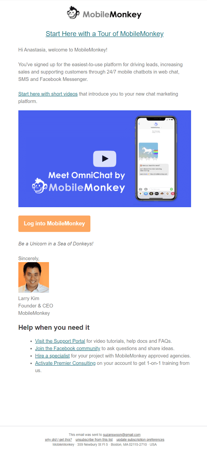
The main goal of this email is to introduce the app via videos, but CTA speaks differently. This makes me a bit confused: “Should I watch a video tour or log into the service?”.
But the desire to be a Unicorn wins.
And I move to the list of useful resources that will help me to make this dream comes true?
What do we like about this email:
- It is short and includes info for the first steps in the service.
- The fact that it is sent by Larry Kim makes me feel special and important.
- Personalization by username.
What could be better: The CTA. Not just “Log into MobileMonkey”, but “Log into to start video tutorial”.
Onboarding email #2
The second email looks rather better about the target action: it invites users to join MobileMonkey Island community on Facebook.
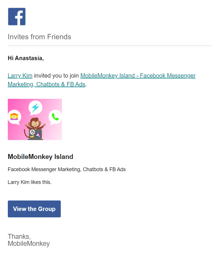
The message is clear. There are no useful articles or any other distracting info. It is important for the company to grow this community.
What do we like about this email: One goal ─ one message ─ one CTA button.
Onboarding email #3
This email engages subscribers to start using MobileMonkey tools with setting up one of its types.
It is hard to say NO to free leads from socials. Moreover, when it takes you only 5 min to start.
MobileMonkey knows my weak points.
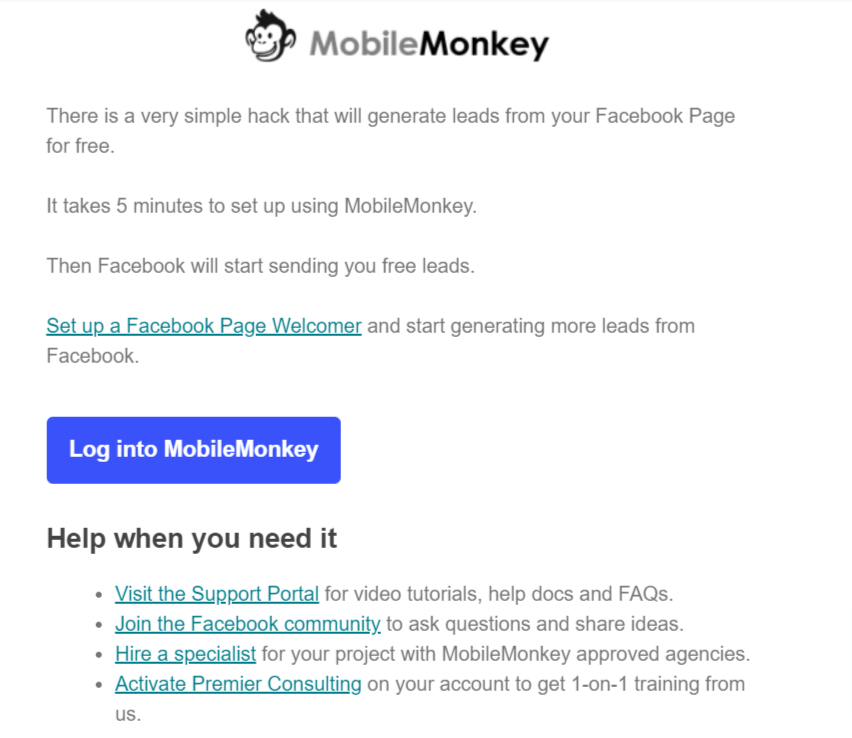
What could be better: The CTA button is better to describe the target action the user should make on the platform after logging in.
Onboarding email #4
It let me know about the Mobile Monkey SMS marketing tool and its features. I’m intrigued to know about such a promising way to communicate with a target audience.
And MobileMonkey has already taken care of that and wrote a tools comparison to save users’ time.
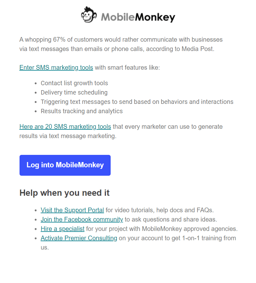
And traditionally, help resources block.
This email hardly looks like an onboarding one. From here MobileMonkeys combine regular informational newsletters with classic onboarding emails.
Read also:
Improve Your Sales Funnel Strategy with In-Depth Reporting
Sales Funnel Automation Strategies for Busy Marketers
Onboarding email #5
This email proves the previous hypothesis. By offering to discover its next tool MobileMonkey invites users to try their notification widget.
This is an attempt to enroll users to try the Pro plan.
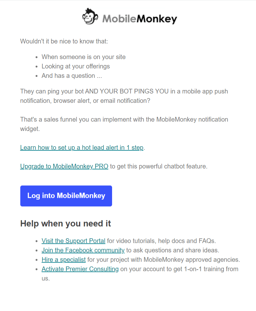
Basically, the notification feature could be replaced by any other from the Pro plan version of the tool.
What we like about this email: The guide part isn’t in the email, its text is on the website. This saves subscribers’ time on reading the newsletter and doesn’t distract from its target action.
Read also: How to make a good email campaign and not get flagged as spam
Onboarding email #6-7
This informational email is an example of bad segmentation. It’s hardly a month like I’m the subscriber of the Mobile Monkey free plan. I don’t need this info.
Or, it’s an opportunity to warn me about the possible consequences of my inactive behavior.
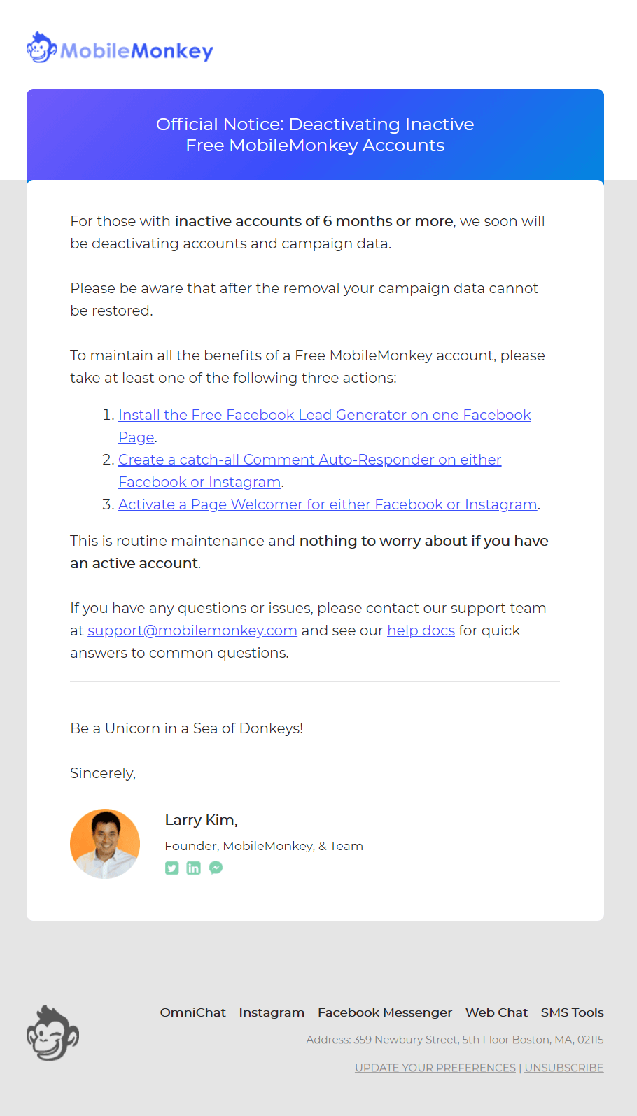
This hypothesis proves the “Nothing to worry if you have an active account” message in this email.
What could be better: It’s a waste of the space of the users’ inboxes. This info doesn’t have any value for the new users, so there is no need to send this email on the first week after sign up. It is better to send it at least in a month.
Onboarding email #8
The classic email onboarding email presenting MobileMonkey next tool. Its chatbot answering Facebook comments presentation is complemented by the article with the relevant examples.
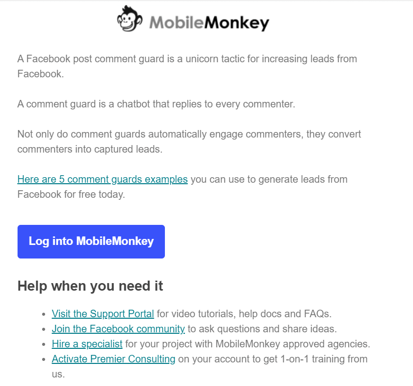
What could be better:
- Visual part. It would be good to show the screen of this bot in action.
The CTA button does not accurately describe the main goal of this email. It could sound like, for example, “Log into to try comment guard”.
Read also: Getting 10% more orders with catch-up email campaigns
Onboarding email #9
After two weeks MobileMonkey users receive an email survey offering them to share feedback on their experience with the platform.
The same survey they send on the 45th day too.
What we like about this email:
- Descriptive and clear CTA button. To enhance a clear call to action they use a time marker.
- No to distract subscribers Facebook community reminder as a second plan action is placed in the text.
Onboarding email #10
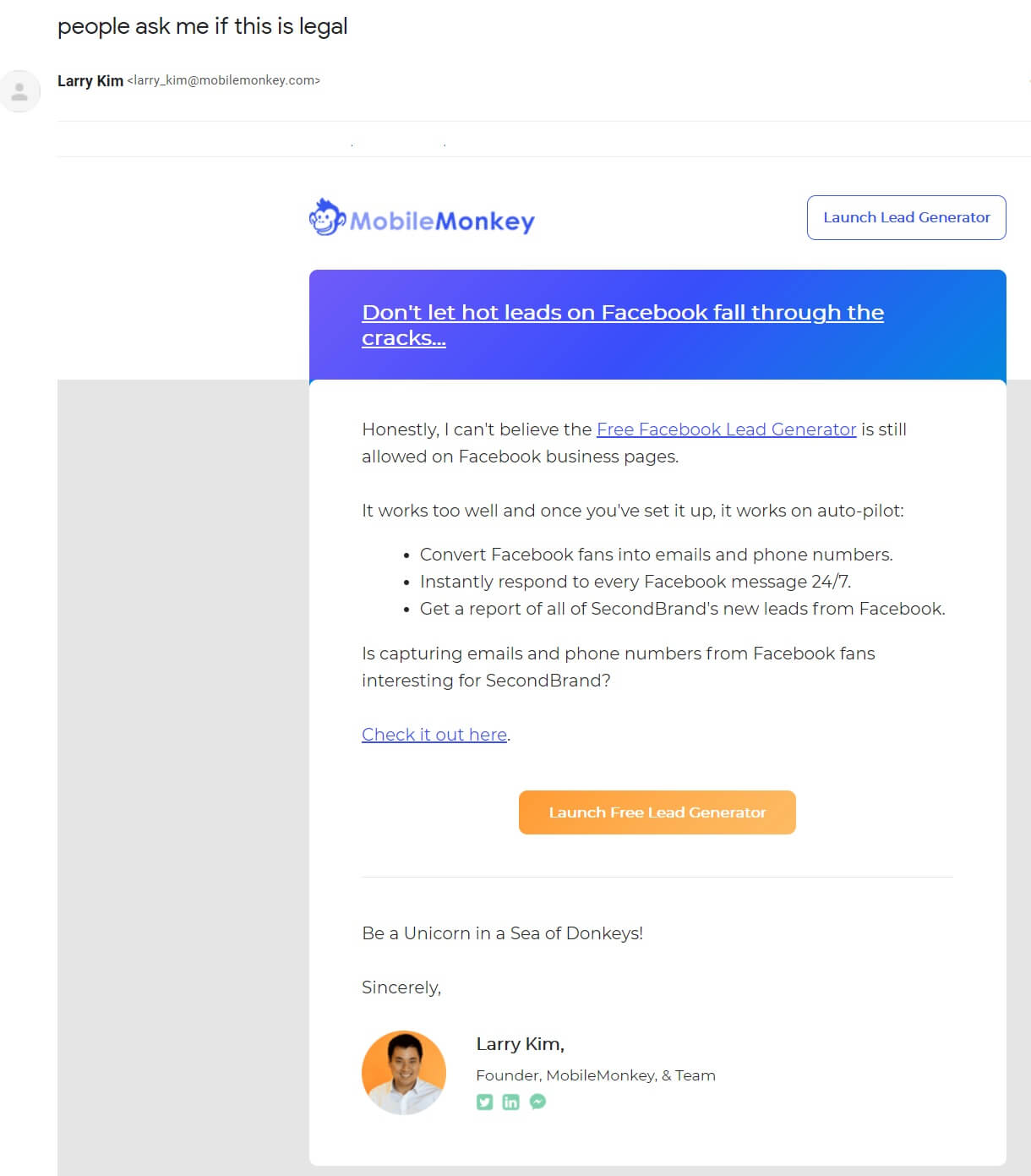
Since MobileMonkey has numerous tools, this email presents the release of its new tool ㅡ Facebook Lead Generator.
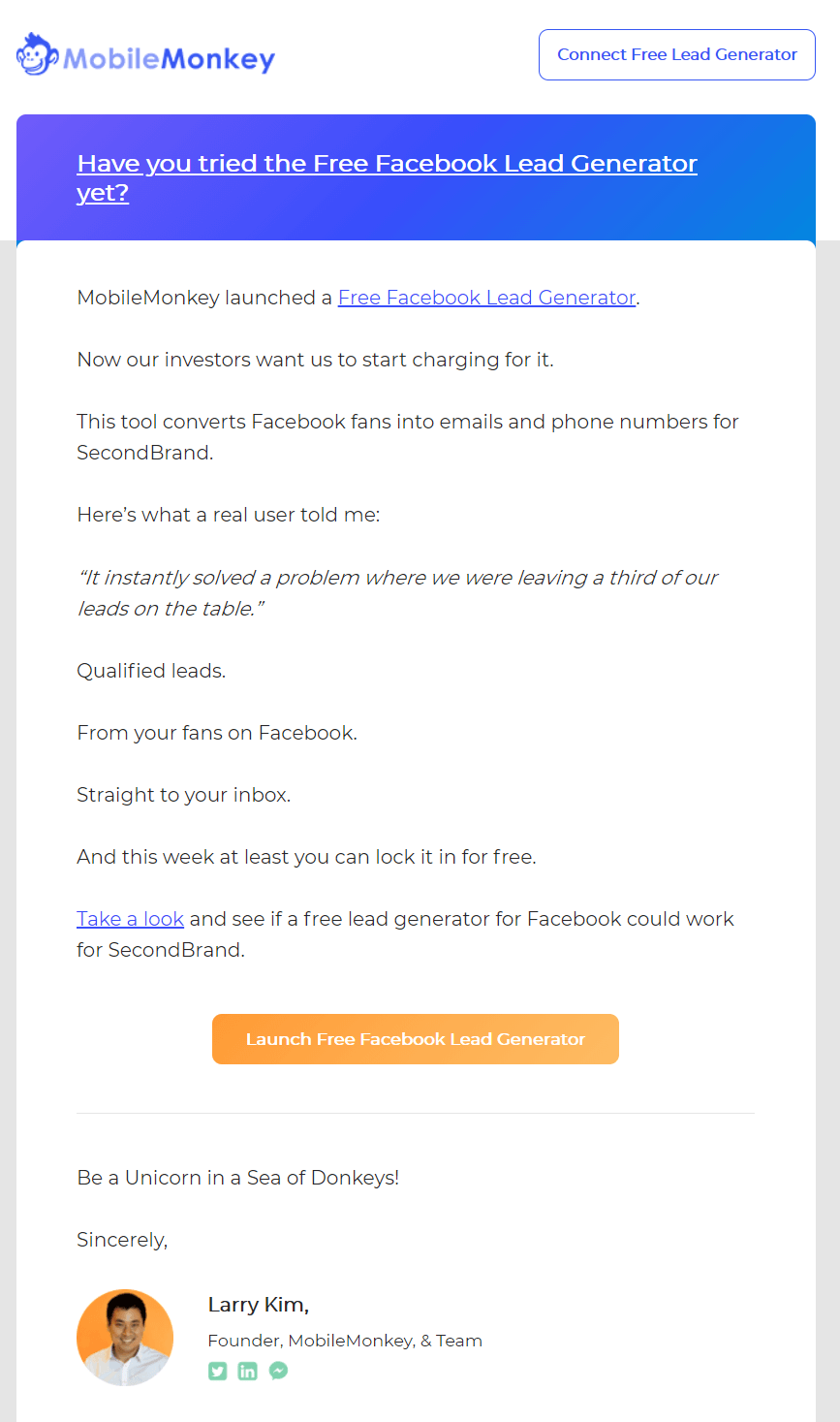
To keep the attention to this tool Larry Kim sends the next email describing its legal part.
What we like about this email: Descriptive CTA.
Short summary of Mobile Monkey onboarding email campaign
- The tool onboarding videos.
- Offer to join the MobileMonkey Island community on Facebook.
- Tool: MobileMonkey Facebook page welcomer.
- Tool: Mobile Monkey SMS marketing tool.
- Information email about Facebook autoresponder + Pro plan enrolment.
- Informational email deactivating inactive users.
- Tool: Facebook comment guard.
- 14th-day Feedback survey
- Tool: Facebook Lead Generator.
It’s long due to the numerous tools this brand offers (orange underline). Thus, they mix them up with service (green underline) and informational newsletters inviting them to join some event or sale (blue underline):
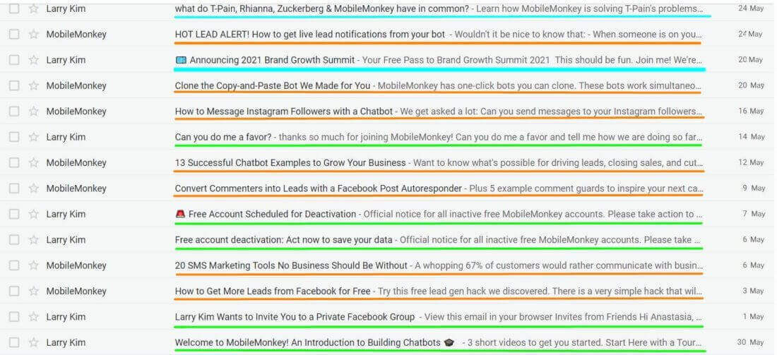
All of the emails are short. You won’t find how-to guides in the text of these emails. The company prefers to describe the value user will get from the tool and engage users to read the needed info in-app.
Good choice to collect insights if your company offers multiple tools.
Read also: 12 types of nurture campaigns
Duolingo
This language training app onboarding emails focused to engage the user to start using the tool with no guidance on how to do it right. This is logical because it’s an app task. It makes Duolingo’s strategy different from the previous.
When I registered on the website, I chose the Russian language to learn, and here are emails I received after that.
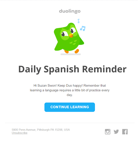
Onboarding email #1
Welcomed by the brand’s owl, users see the action plan engaging them to download the app and start training.
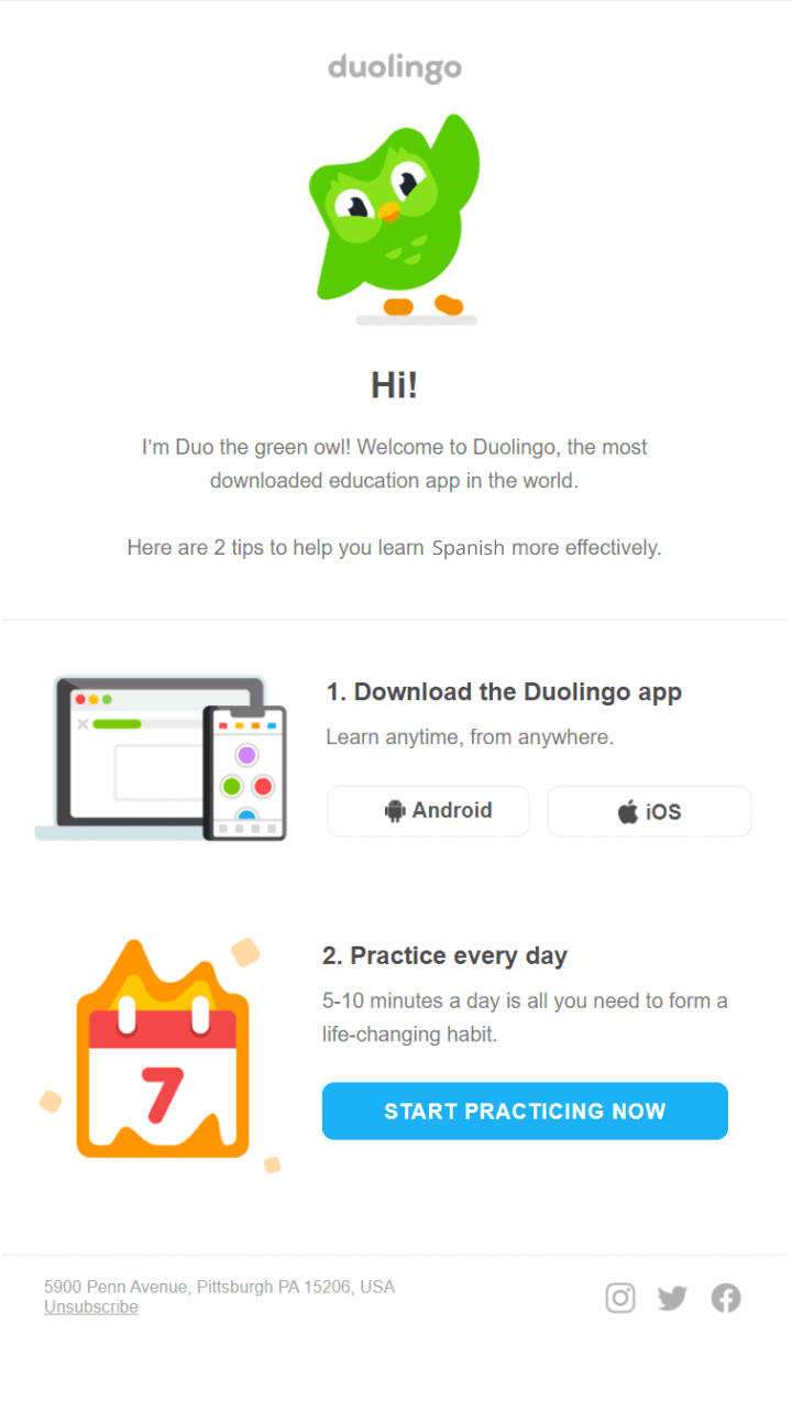
What we like about this email: Clear design and short message that will take you 1-2 min to read it.
What could be better:
- All of these emails lack personalization. At least they could add a username right after Hi! Phrase.
- One email should contain one CTA. So, it is better to divide this email into the first about downloading the app and the second one engaging to start learning.
Duolingo likes the last phrase so much that they repeated it during the next seven days (Sounds like a secret spell to convert a subscriber into an active client).
Reminder onboarding email 2-8
No, this isn’t a mistake. Duolingo sends 7 email reminders with little change in text inviting users to “CONTINUE LEARNING”
What we like about this email: Traditionally short message taking you 1 min to read. Clear design focuses subscriber attention on the bright button, engaging to CONTINUE LEARNING.
What could be better: Intrigue subscribers with useful info they don’t know but can learn in the app.
Read also:
Top Metrics to Track in Your Sales Funnel Reports
Sales Funnel Automation Simplified: A Beginner’s Guide
Onboarding email #9
After the eight-day I ignored its emails, Duolingo changed the tactic.
“Don’t know a foreign language? Throw your passport away and stay home!” ─ the short version of the argument Duolingo uses to engage users to CONTINUE LEARNING in the eights email.
Right after that, Duo owl offers three tips on how to set and meet learning goals.
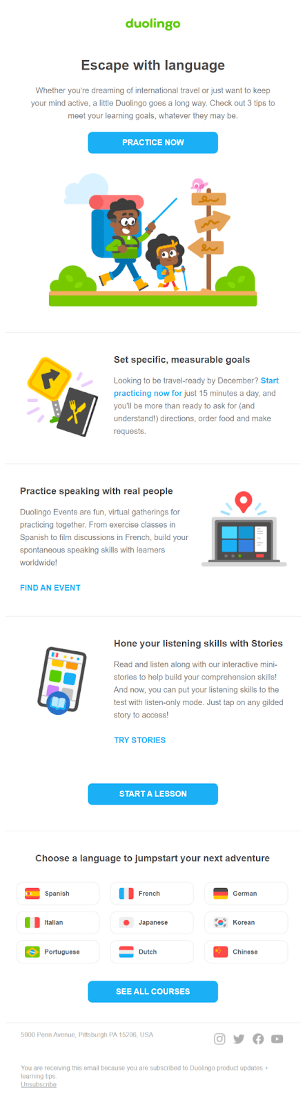
Trying to back the inactive users, Duolingo offers to choose other languages to learn. That is a smart move because it offers the user to see other use cases of the same tool.
What we like about this email: It’s long enough to guide the subscriber through all the tips and not to fall asleep in the middle.
What could be better:
- Focus. Three CTA buttons can be replaced by one complemented by simple in-text links (one email — one action principle, if you remember).
- I miss Duo owl. Why can’t he guide travelers on the first image instead of the pink something? If you follow the brand design, there shouldn’t be exceptions.
Onboarding email #10
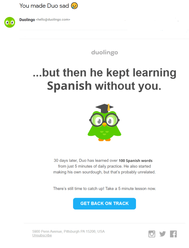
On the one hand, it is the same text from the previous seven reminders, on the other ─ it is more creative. Trying to make subscribers envy Duo’s owl progress in learning, Duolingo bids farewell to them because it is the last email they sent me.
That makes me guilty, and I almost GOT BACK ON TRACK (maybe after, when I’ll finish this article ?).
What we like about this email: I won’t repeat about the size, but just look at that headline. Love the intrigues of the unfinished sentence…
and its continuation in the email.
What could be better: Headline, owl, one CTA ― it’s perfect.
Short summary of Duolingo onboarding emails:
- 1 Welcome message + CTA to download the app.
- 2 — 8 Reminders to continues learning (highlighted with red).
- 9 How to use the tool (set goals).
- 10 Reactivation email.
They sent emails each day since I signed up. 70% of newsletters are reminders to CONTINUE LEARNING. It is a simple, but at the same time interesting tactic to engage new users to use an app. This onboarding campaign has its weak points in the number of CTAs but still is interesting from the point of saving resources.
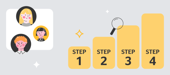
How to launch an onboarding email campaign in Dashly?
- In the Dashly admin panel, go to Triggered messages>Templates>Welcome email and change its content in the visual editor (outlined with orange) or in HTML code:
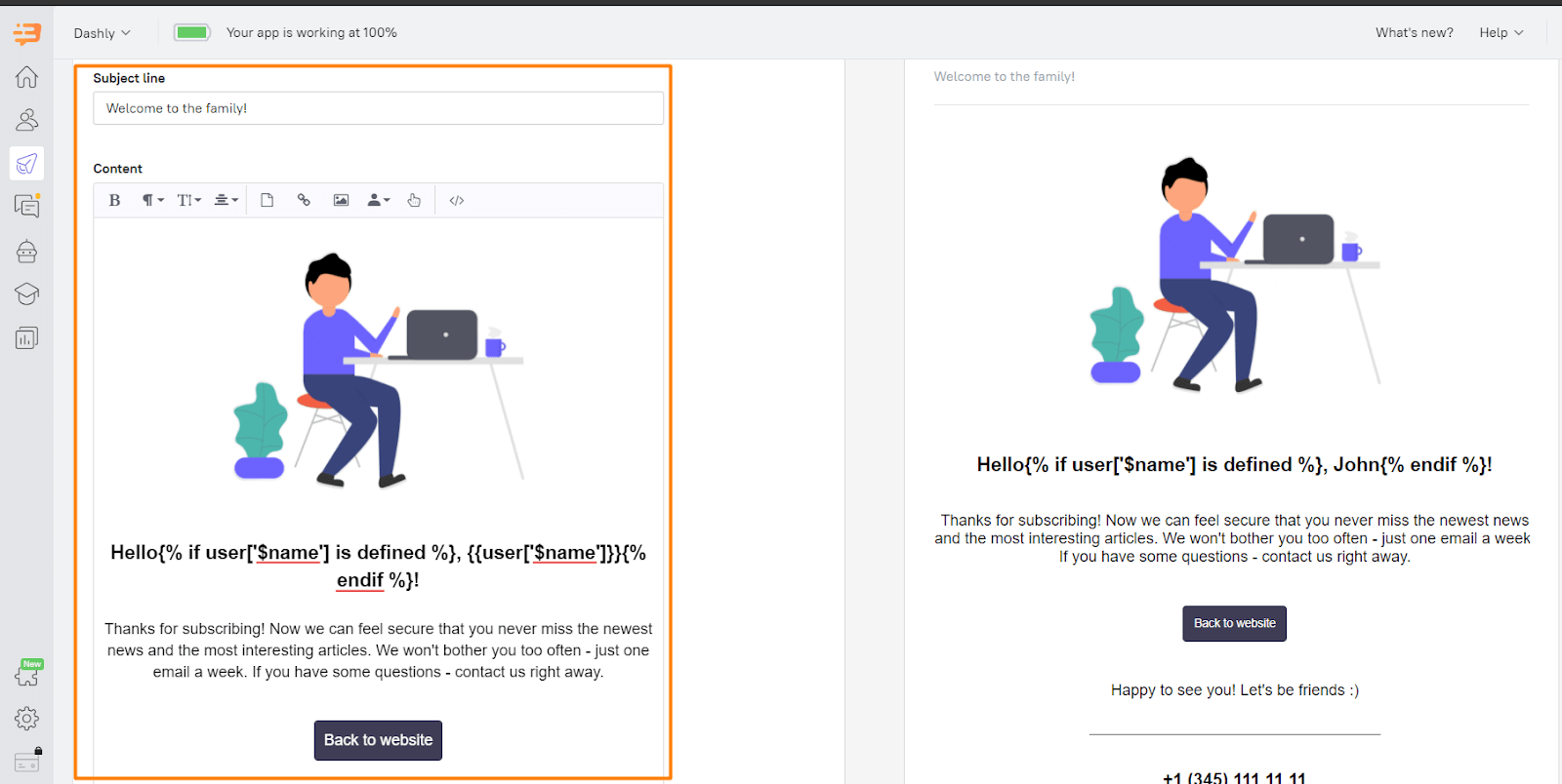
- Keep the design simple. 1-2 images are enough.
Good news. You shouldn’t care about the mobile optimization of your emails. Dashly makes your emails look good regardless of device and screen size. - Leverage personalization by name with the variables. Dashly uses the data your subscriber entered during sign-up.
Read also: Winning The Customer With Personalized Messages Where They Are Truly Relevant
- Center content around your call-to-action. It’s better to highlight your tool’s benefits rather than its features. Thus, you’ll show what your subscribers can gain by using it.
- Use a company or employee email address rather than a generic address like support@, sales@, or info@.
- When you finish the design and copy part, click “Create triggered message” to choose the time and event to send the first email:
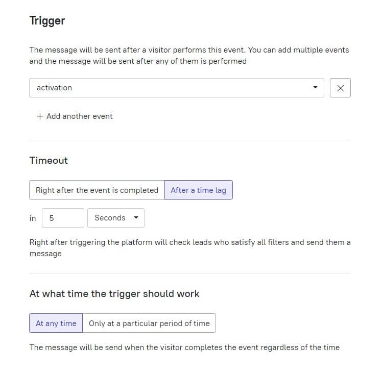
To set a trigger, you should create an event first. It’s easy. When users will perform this action, they will get your message.
If it is a confirmation email, send it immediately. The welcome one can be sent even a day after the user registration.
Read also: The guide on how to design an autofunnel
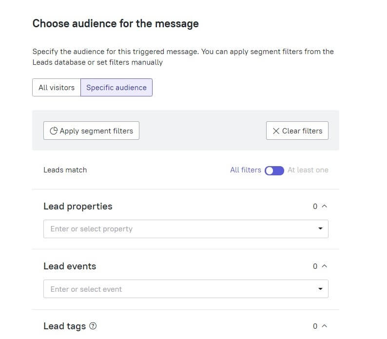
- You can define the people who will receive your email with special lead properties and tags if needed. But the first message doesn’t require this step.
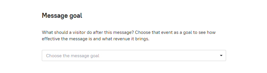
- Set the message goal, for example, visiting the Pro plan page, to see the Conversion Rate of this email and what revenue it brings then.
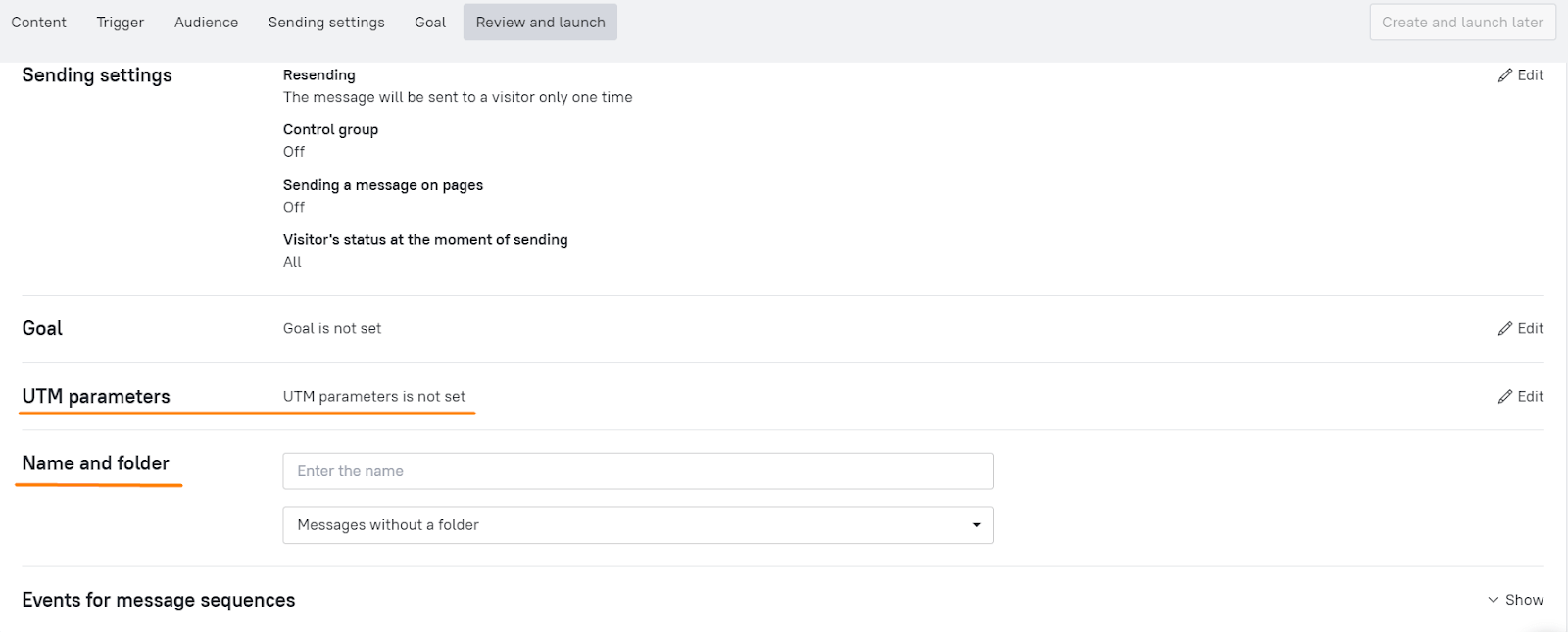
- Add UTM parameters and set the Message folder. “Onboarding campaign” for instance.
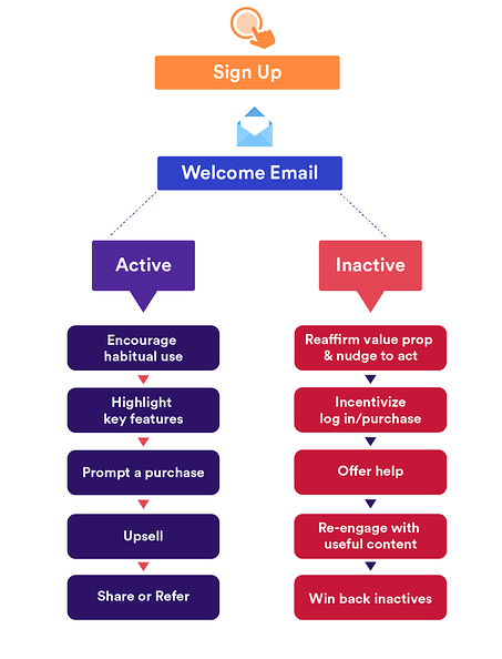
- Segment your following emails audience. Create different sequences for active and inactive users based on the users’ reactions to the first email. Just copy the email you’ve created and change its content and sending time. For example, a day after the first email was sent.
This is only an example of email types within your onboarding campaign. To find more examples, back to the short summary of onboarding email campaigns we analyzed before.
FAQ on email onboarding campaigns
- What is an email onboarding campaign?
It is a series of emails aimed to guide and educate new users about how to use a product effectively.
- How often to send onboarding emails?
Once per 1-2 days is a typical period of onboarding email sending time.
- How many emails to send during the onboarding campaign?
It varies according to the number of your tools and the level of their complexity. But it’s better not to annoy subscribers and send no more than 10-12 onboarding emails. If you need more, mix it up with the information ones, as MobileMonkey does.
Use it free for 7 days

Read also: Acquisition funnel marketing: Grow customer conversions at each step of user journey